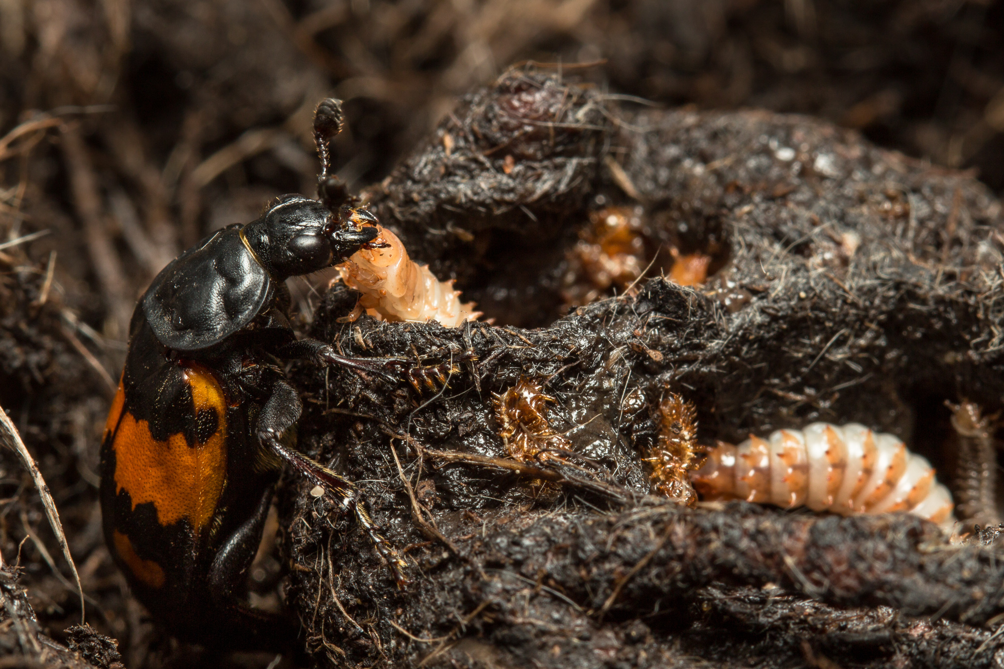
Thanks to the fine work of Cambridge’s Prof. Rebecca Kilner and her colleagues, in addition to her giving me access to her lab next year to photograph her beetles, today I have a photograph appearing in The Economist! The Kilner group have a new paper in the journal eLife that demonstrates how different levels of parental care have strong effects on offspring once they themselves have reached adulthood. I made the photograph above available via Creative Commons Attribution Licence so that it could be used in eLife, but The Economist wanted to use a different one, which they paid a licensing fee for (see below):
Coverage of the paper, along with my photos, is taking off – see IFLS, phys.org, the Naked Scientists (includes podcast interview with Becky), Cambridge University‘s general coverage (with links to Radio 4 interview with Becky)…
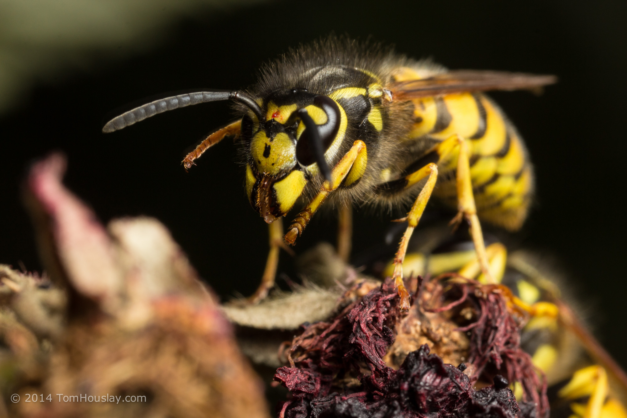
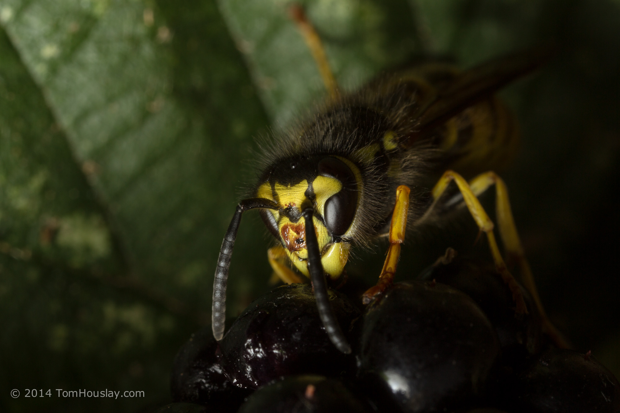
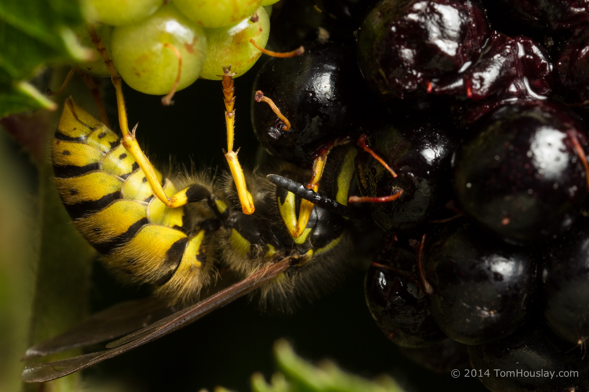
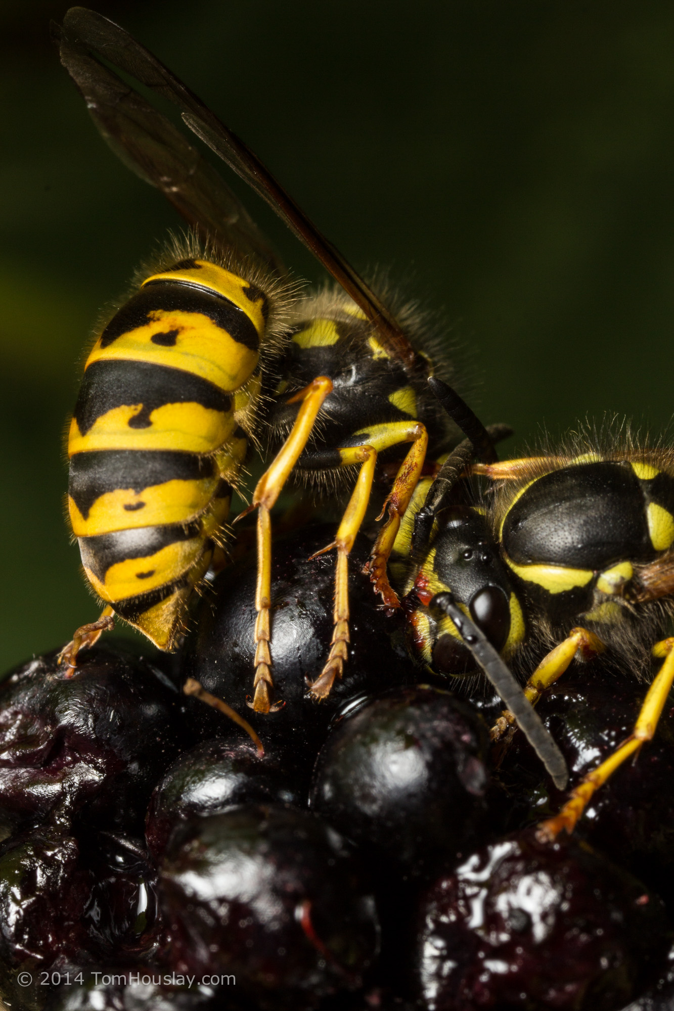
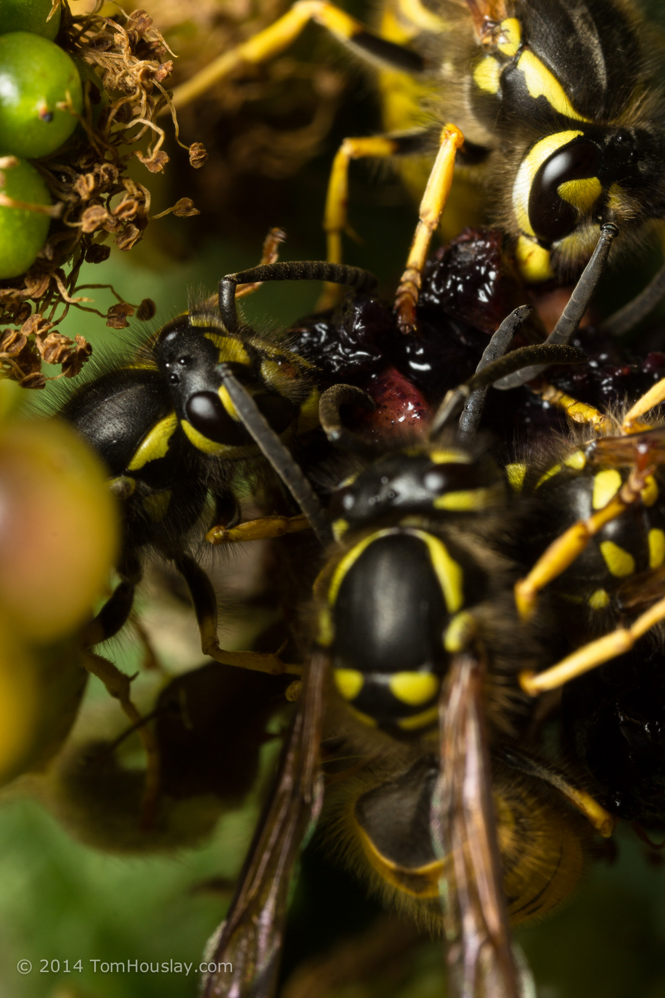
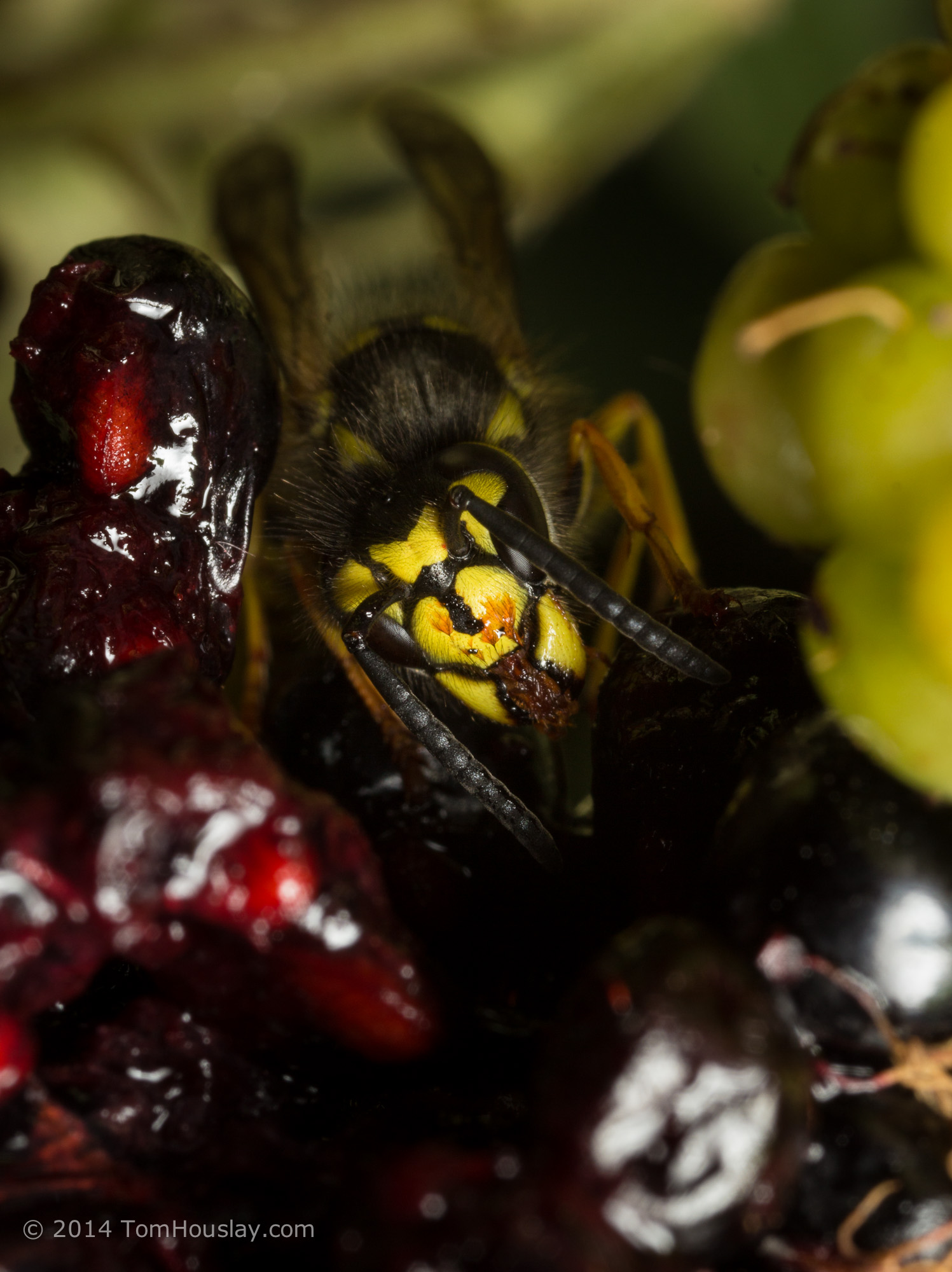
I had a lot of fun trying to photograph the behaviour of these beetles, so here are some more pics!
I posted recently (well… not that recently, now that I remember that time is linear) about how to visualise 3-way interactions between continuous and categorical variables (using 1 continuous and 2 categorical variables), which was a follow-up to my extraordinarily successful post on 3-way interactions between 3 continuous variables (by ‘extraordinarily successful’, I mean some people read it on purpose and not because they were misdirected by poorly-thought google search terms, which is what happens with the majority of my graphic insect-sex posts). I used ‘small multiples‘, and also predicting model fits when holding particular variables at distinct values.
ANYWAY…
I just had a comment on the recent post, and it got me thinking about combining these approaches:
There are a number of approaches we can use here, so I’ll run through a couple of examples. First, however, we need to make up some fake data! I don’t know anything about bone / muscle stuff (let’s not delve too far into what a PhD in biology really means), so I’ve taken the liberty of just making up some crap that I thought might vaguely make sense. You can see here that I’ve also pretended we have a weirdly complete and non-overlapping set of data, with one observation of bone for every combination of muscle (continuous predictor), age (continuous covariate), and group (categorical covariate). Note that the libraries you’ll need for this script include {dplyr}, {broom}, and {ggplot2}.
#### Create fake data ####
bone_dat <- data.frame(expand.grid(muscle = seq(50,99),
age = seq(18,65),
groupA = c(0,1)))## Set up our coefficients to make the fake bone data
coef_int <- 250
coef_muscle <- 4.5
coef_age <- -1.3
coef_groupA <- -150
coef_muscle_age <- -0.07
coef_groupA_age <- -0.05
coef_groupA_muscle <- 0.3
coef_groupA_age_muscle <- 0.093
bone_dat <- bone_dat %>%
mutate(bone = coef_int +
(muscle * coef_muscle) +
(age * coef_age) +
(groupA * coef_groupA) +
(muscle * age * coef_muscle_age) +
(groupA * age * coef_groupA_age) +
(groupA * muscle * coef_groupA_muscle) +
(groupA * muscle * age * coef_groupA_age_muscle))ggplot(bone_dat,
aes(x = bone)) +
geom_histogram(color = 'black',
fill = 'white') +
theme_classic() +
facet_grid(. ~ groupA)## Add some random noise
noise <- rnorm(nrow(bone_dat),0,20)
bone_dat$bone <- bone_dat$bone + noise
#### Analyse ####
mod_bone <- lm(bone ~ muscle * age * groupA,data = bone_dat)plot(mod_bone)
Residual standard error: 19.85 on 4792 degrees of freedom
Multiple R-squared: 0.9728, Adjusted R-squared: 0.9728
F-statistic: 2.451e+04 on 7 and 4792 DF, p-value: < 2.2e-16
(EDIT: Note that this post is only on how to visualise the results of your analysis; it is based on the assumption that you have done the initial data exploration and analysis steps yourself already, and are satisfied that you have the correct final model… I may write a post on this at a later date, but for now I’d recommend Zuur et al’s 2010 paper, ‘A protocol for data exploration to avoid common statistical problems‘. Or you should come on the stats course that Luc Bussière and I run).
Checking the residuals etc indicates (to nobody’s surprise) that everything is looking pretty glorious from our analysis. But how to actually interpret these interactions?
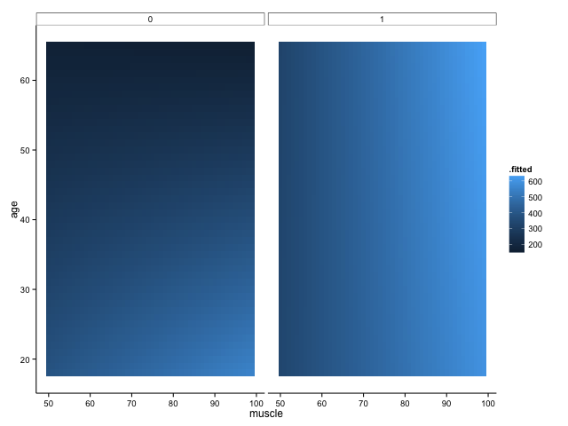
We shall definitely have to use small multiples, because otherwise we shall quickly become overwhelmed. One method is to use a ‘heatmap’ style approach; this lets us plot in the style of a 3D surface, where our predictors / covariates are on the axes, and different colour regions within parameter space represent higher or lower values. If this sounds like gibberish, it’s really quite simple to get when you see the plot:
Here, higher values of bone are in lighter shades of blue, while lower values of bone are in darker shades. Moving horizontally, vertically or diagonally through combinations of muscle and age show you how bone changes; moreover, you can see how the relationships are different in different groups (i.e., the distinct facets).
To make this plot, I used one of my favourite new packages, ‘{broom}‘, in conjunction with the ever-glorious {ggplot2}. The code is amazingly simple, using broom’s ‘augment’ function to get predicted values from our linear regression model:
But note that one aspect of broom is that augment just adds predicted values (and other cool stuff, like standard errors around the prediction) to your original data frame. That means that if you didn’t have such a complete data set, you would be missing predicted values because you didn’t have those original combinations of variables in your data frame. For example, if we sample 50% of the fake data, modelled it in the same way and plotted it, we would get this:
Not quite so pretty. There are ways around this (e.g. using ‘predict’ to fill all the gaps), but let’s move onto some different ways of visualising the data – not least because I still feel like it’s a little hard to get a handle on what’s really going on with these interactions.
A trick that we’ve seen before for looking at interactions between continuous variables is to look at only high/low values of one, across the whole range of another: in this case, we would show how bone changes with muscle in younger and older people separately. We could then use small multiples to view these relationships in distinct panels for each group (ethnic groups, in the example provided by the commenter above).
Here, I create a fake data set to use for predictions, where I have the full range of muscle (50:99), the full range of groups (0,1), and then age is at 1 standard deviation above or below the mean. The ‘expand.grid’ function simply creates every combination of these values for us! I use ‘predict’ to create predicted values from our linear model, and then add an additional variable to tell us whether the row is for a ‘young’ or ‘old’ person (this is really just for the sake of the legend):
Here, we can quite clearly see how the relationship between muscle and bone depends on age, but that this dependency is different across groups. Cool! This is, of course, likely to be more extreme than you would find in your real data, but let’s not worry about subtlety here…
You’ll also note that I’ve commented out some lines in the specification of the plot. These show you how you would plot your raw data points onto this figure if you wanted to, but it doesn’t make a whole lot of sense here (as it would include all ages), and also our fake data set is so dense that it just obscures meaning. Good to have in your back pocket though!
Finally, what if we were more concerned with comparing the bone:muscle relationship of different groups against each other, and doing this at distinct ages? We could just switch things around, with each group a line on a single panel, with separate panels for ages. Just to make it interesting, let’s have three age groups this time: young (mean – 1SD), average (mean), old (mean + 1SD):
#### Groups on a single plot, with facets for different age values ####
avAge <- round(mean(bone_dat$age))
sdAge <- round(sd(bone_dat$age))
youngAge <- avAge - sdAge
oldAge <- avAge + sdAge
bone_pred2 <- data.frame(expand.grid(muscle = seq(50,99),
age = c(youngAge,
avAge,
oldAge),
groupA = c(0,1)))
bone_pred2 <- cbind(bone_pred2,predict(mod_bone,
newdata = bone_pred2,interval = "confidence"))ggplot(bone_pred2,
aes(x = muscle,
y = fit,
colour = factor(groupA))) +
geom_line() +
facet_grid(. ~ age) +
theme_classic()
Interestingly, I think this gives us the most insightful version yet. Bone increases with muscle, and does so at a higher rate for those in group A (i.e., group A == 1). The positive relationship between bone and muscle diminishes at higher ages, but this is only really evident in non-A individuals.
Taking a look at our table of coefficients again, this makes sense:
There is a positive interaction between group A x muscle x bone, which – in group A individuals – overrides the negative muscle x age interaction. The main effect of muscle is to increase bone mass (positive slope), while the main effect of age is to decrease it (in this particular visualisation, you can see this because there is essentially an age-related intercept that decreases along the panels).
These are just a few of the potential solutions, but I hope they also serve to indicate how taking the time to explore options can really help you figure out what’s going on in your analysis. Of course, you shouldn’t really believe these patterns if you can’t see them in your data in the first place though!
Unfortunately, I can’t help our poor reader with her decision to use Stata, but these things happen…
Note: if you like this sort of thing, why not sign up for the ‘Advancing in statistical modelling using R‘ workshop that I teach with Luc Bussière? Not only will you learn lots of cool stuff about regression (from straightforward linear models up to GLMMs), you’ll also learn tricks for manipulating and tidying data, plotting, and visualising your model fits! Also, it’s held on the bonny banks of Loch Lomond. It is delightful.
—-
Want to know more about understanding and visualising interactions in multiple linear regression? Check out my previous posts:
Things have been pretty slow on the updating side (yet again), but I have been busy with THINGS and also STUFF!
I have just had my first research paper (snappily titled ‘Sex differences in the effects of juvenile and adult diet on age-dependent reproductive effort‘) from my PhD published, in the Journal of Evolutionary Biology. Happily, the review process was really great – the editor (Thomas Flatt) was really helpful, and we had great, constructive reviews from Sue Bertram and Mike Kasumovic (who did sign their reviews, I’m not just outing them!).
In the paper, we manipulated resource acquisition at both the juvenile and adult stage in male and female crickets, and tracked allocation to age-dependent reproductive effort. Crickets are great for this kind of work, as reproductive effort is easy to quantify for both males and females (not the case in a great many organisms): fecundity (i.e., egg production) in females, and sexual signalling (time spent calling) in males. We investigated how resource acquisition affects allocation to reproductive effort over time, and also how this affects investment in longevity… Not only did we find some interesting results, but I also got to showcase the use of Zero-Altered Poisson (ZAP) models for male signalling! This is a really useful type of statistical analysis, as we can look at two factors within a single model:
What factors affect whether a male calls or not (binary ‘0/1’ response)?
Given that a male does call (i.e., a ‘1’ in the first part of the model), what factors affect how much he calls?
I’m currently working on a manuscript which will delve a little deeper into questions of male signalling, using ZAP models but also a pretty cool experimental design that I think has given us some really interesting results (let’s hope the reviewers agree!). I’ll also be talking about this work at the European Society of Evolutionary Biology (ESEB) conference in Lausanne this August (so hopefully I can get it submitted for publication soon!).
The other big news is that I have finally secured a new research position! I have joined Alastair Wilson’s group at the University of Exeter’s Penryn campus, and my postdoc will focus on the evolution of stress response. This will entail lots of behavioural work and measuring hormones, as well as some pretty intense stats and quantitative genetics! Also, I’m having to learn about vertebrates, as the study system will be guppies… but don’t worry, I’ll still be tweeting / going on about weird insect sex as much as possible. Everyone’s got to have a hobby.
Other stuff: I’ve had a couple of photos published in scientific journals, which happen to also be really cool papers so worth reading (see links below)! I am also working on a setup to get some good guppy photos ready for my own future talks / papers.
2014 is drawing to a close; it’s been a weird year, and I didn’t realise until now quite how much I’ve neglected writing posts on here. I have been spending more time on photography, although you will have to indulge the first section of this post being filled with photos taken by others…
LEVEL UP: PhD achieved!
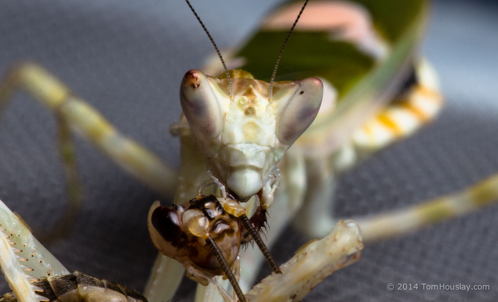
I have a good excuse for no blog posts during the first couple of months of 2014 at least, as my PhD thesis was due for submission at the end of February. My state of mind is probably evident in that the only photographs I took during this period were of my pet mantis eating some of my study species (the decorated cricket, Gryllodes sigillatus).
Even more telling are the photos of me handing in my thesis.
Yes. That’s the face of a man who has barely slept for many days, getting blasted by a party popper. Thankfully I was looking a little better by April, when I defended my thesis (‘Causes of adaptive differences in age-dependent reproductive effort’) in my viva; Dr. Andre Gilburn (University of Stirling) and Dr. Alexei Maklakov (Uppsala University) were the examiners, and we had a really interesting and fun discussion! As several people have said, you should make the most of talking to the only people who will ever read your thesis…
Of course, I looked even better once I had donned my viva hat; this was devised and created by next-in-line at the Bussiere lab, Ros Murray. Lilly has a lot to live up to when it comes to making Ros’ hat!
I should take a quick moment here to thank not only Luc, a fantastic supervisor (and all-round awesome guy), but also Ros and Lilly for general labmate amazingness, the rest of the Bussière lab (particularly Claudia, Toby, Svenja and Rheanne), Matt Tinsley, Stu Auld, Pauline Monteith and Jim Weir. Also the crickets. Sorry you’re all dead! The crickets, I mean. All of the humans are still alive. I think. And if they’re not, I definitely had nothing to do with it.
Goodbye to Scotland
Kirsty also finished her postdoc at around the same time as my PhD ended, but we managed a few trips to see some wildlife before leaving our beloved tiny Stirling flat – including iconic golden eagles in Findhorn Valley:
Which mainly involved doing this for ages:
But it was awesome. Also awesome: OTHER STUFF IN SCOTLAND. The following photos were taken at the Argaty red kite station near Doune; Carron Glen nature reserve in Denny; Loch Garten; and Baron’s Haugh nature reserve.
Cambridge & macro
We moved to Cambridge in May, and I have been amazed at the increase in invertebrate diversity compared to central Scotland… also, we have a pretty great garden, and nice fields and nature reserves nearby to go wandering around! I have been using these opportunities to practise macrophotography, using my Canon 100mm macro, the Canon MP-e 65, and the Sigma 15mm lens for some wide-angle macro…
I have also been photographing burying beetles for Prof. Becky Kilner’s group at the University of Cambridge, and one of these photos was given a commendation in the Royal Entomological Society’s National Insect Week photography competition:
I have also tried to branch out into some non-macro photography, particularly playing around with long exposures, flash, and some black-and-white work. The first photo here was taken on the banks of Loch Lomond in December, by the SCENE field station where I was teaching a workshop on statistics and R alongside Luc (another one to be held in April, and places are already running out!).
Breaking Bio podcast
The podcast has had something of an up-and-down year, as we’ve all been crazily busy and it’s hard to pin everyone (plus guest) down for a timeslot weekly. However, we’ve still had some great episodes; here are some of my favourites:
The inimitable, execrable, unrepentant badass that is Katie Hinde. Did you know that studying the evolution of lactation was a thing? IT IS.
Marlene Zuk is a bit of a science hero. Strike that: she’s a LOT of a science hero. We talk rapid evolution and crickets, at least while I can stammer out some words (I was late and SCIENCESTRUCK).
We also got involved with #SAFE13, a really important movement that is well represented by the fantastic work of Kate Clancy, Katie Hinde, Robin Nelson, and Julienne Rutherford. Not quite as light-hearted as the others above, but certainly thought-provoking and well worth half an hour of your time.
To 2015!
Next year, I’ll be trying to write some fun posts on research that excites me, and hopefully illustrated with more photos! I am trying to concentrate on getting interesting shots, either due to animal behaviour or better composition. I would appreciate any comments on photos here or on my 500px / flickr pages; any comments or suggestions about blog post entries are always welcome too! Hopefully the BreakingBio podcast will start strongly again in 2015 too, as we have some great guests lined up to join us.
Also, I need a proper job. I’m trying to push through publications right now, so hopefully I’ll have some paper summaries of my own to come…
Some time ago, I wrote a post on here. It was reasonably popular, but I deleted it for foolish reasons. However, I no longer care about those reasons, so now I’ve edited it slightly and it’s back! Enjoy? ENJOY!
If you’re the type of person who frequents animal behaviour blogs, you probably love yourself some animal sex posts (I sometimes feel like I should put some sort of “it’s science so it’s not weird OKAY” disclaimer or something here, but you should be used to it by now… and also I get so many hits from people googling ‘dolphin rape’ that I don’t think it would really make any difference). Such a predilection for tales of animal mating systems will mean you’re most likely well acquainted with the ornaments, weapons and displays that males (for the most part) of a huge variety of shapes, sizes, and species use to improve their chances of mating. Perhaps you’ve tired of pictures of peacock trains and scarab beetle horns; those videos of jumping spiders shaking their curiously colourful buttflaps (erm, you should get used to this level of technical terminology) or bowerbirds prancing around their ornately decorated nests just don’t cut it for you these days.
(I’m really sorry to the people who took the original photographs that I have ruined there)
Even Stephen Stearns doing his sage grouse impression isn’t enough.
Give us more, you cry: we need more sexual dimorphism! More weird behaviours! Different body shapes! Life histories! Displays, weapons, ornaments, EVERYTHING!
Well, I was flicking through my copy of Thornhill and Alcock’s seminal (hurr hurr) work, ‘The Evolution of Insect Mating Systems’, and happened upon a short passage describing the Strepsipteran order of insects. ‘Strepsiptera’ translates as ‘twisted wing’, but the curious wing shape that gives these insects their name is not the main reason that they piqued my interest. No, it’s because the sub-order Stylopidia has some extreme sexual dimorphism going on: only the males actually grow wings, legs, antennae, mouthparts, eyes, or any of the traits that we associate with adult insects; the females, meanwhile, have none of these features. Male flight is required because they need to find a female to mate with, and quick, because these guys only live for a few hours after emerging as adults.
Male (left) and female (right) Xenos vesparum.
So while males are flying around in a desperate sexual frenzy, what are their rather curious female counterparts doing? And where are the females, if they have no means of locomotion? The Strepsiptera are ‘obligate parasites’, meaning that some part of their life cycle must take place within a host animal. Hosts include a whole variety of different insects, including silverfish, crickets, stink bugs, wasps, bees, flies… In one particular family, the Myrmecolacidae, males parasitise ants while females parasitise Orthopteran insects. Female Strepsipterans never leave their hosts, instead sitting pretty – at least, about as pretty as a wingless, eyeless, mouthless parasite can get – and waiting for a male to come along. To move things along, virgin females help out by releasing a pheromone that males can use to home in on a potential mate before suffering an early death.
Females poking out from betwixt the thoracic segments of a Polistes wasp.
Oh, ok. I get it. People are immune to weird sexual dimorphisms in insects these days. Fur and feathers, that’s what you want. Maybe if it were a lion with wings flying around briefly in search of a weird giant worm thing to hump, then you’d be impressed? Also, the giant no-face lion-worm would probably live in a giraffe’s bum. Then you’d care. Then you’d ALL care. You want to know something else about the Stylopidae? Well, there’s some controversy over how they mate, but one of the main hypotheses is that mating occurs via TRAUMATIC INSEMINATION.
…also known as HYPODERMIC INSEMINATION.
Why is it called that? Well, males have a pointed, hook-like aedaegus, which is an appendage used to transfer sperm to the female. It’s a bit like a penis, although in deference to this particular method of reproduction, let’s just call it a STABBYCOCKDAGGER*. The male, without so much as a by-your-leave, simply shunts his STABBYCOCKDAGGER straight into the female, releasing sperm into her body cavity.
STABBYCOCKDAGGER
This isn’t controversial because of the process itself – after all, traumatic insemination is well-characterised in various other species (in particular, the Cimicidae – or bedbug – family: one of the most interesting talks I’ve ever seen was Mike Siva-Jothy presenting some of his work on bedbugs at the ESEB conference in Tuebingen, 2010) – but more due to the lack of detail as to how or why this might have evolved. The reasons for such an adaptation include the following: bypassing ‘mating plugs’ (in many species, a male can inject a secretion into the female’s reproductive tract, ‘gluing’ it closed, or can even break off its penis – or STABBYCOCKDAGGER – in the female so as to block access by rivals); getting round female resistance to mating; eliminating any time that would otherwise be required for courtship; or even in terms of sperm competition, by enabling males to deposit their sperm closer to female ovaries. However, studies indicate that short-lived Stylops males are unlikely to encounter many competitors, and the females stop producing the attractive pheromone just a few days after mating (so the period during which she may attract males is reasonably brief). A study using scanning and transmission electron microscopy in Xenos vesparum failed to either support or rule out traumatic insemination as a mating strategy, but did provide further evidence (adding to studies dating back to the 1840s) that males could simply be using their STABBYCOCKDAGGER to spread sperm fluid into the female’s ‘ventral canal’, which sounds like a much more soothing process. In fact, a ‘spread into a ventral canal’ sounds like a nice holiday that you might take in the Cotswolds. It is possible that this latter method was actually the ancestral form of mating, and that traumatic insemination has developed more recently – potentially so as to bias paternity.
Yes, I know that isn’t a face, it’s the female’s ventral canal. POETIC LICENCE, YEAH?
Are you happy now?
Happy?, you might ask, happy that you just did the text-based equivalent of screaming STABBYCOCKDAGGER in my face, over and over again?
Oh. Well, then you might be interested to hear about ‘hemocelous viviparity’. Doesn’t sound so bad, right? It’s just that the eggs hatch inside the female, and the offspring eat their mother from the inside out; the larvae then escape from the host and use tiny little legs to run around and find new hosts.
Also, in the case of X. vesparum, the host is a wasp named Polistes dominulus; parasitised female wasps become sterile, inactive, and leave their colony to form aggregations where the parasites can perform their curious mating. Cappa et al. describe them memorably as “idle, gregarious ‘zombies’”. There is also evidence that ants parasitised by other Strepsipterans tend to linger on the tips of grass stems, even in bright sunlight, which may increase the chances of males finding a mate, or even just give the males a good start when emerging from their own host. Such behaviours may be due to our twisted little parasites somehow manipulating their hosts to their own ends.
To conclude: extreme sexual dimorphism, traumatic insemination, cannibalisation of their own parents, and turning hosts into sterile zombies? Safe to say these strange little flies do a little bit of everything. And maybe, just maybe, you’re glad that creatures the size of lions don’t behave like this after all.
*I asked on Twitter whether people had a preference towards either ‘STABBYCOCKDAGGER’ or ‘STABBYCOCKNEEDLE’. The results were overwhelmingly in favour of ‘STABBYCOCKDAGGER’.
Gregory Paulson has a nice bunch of SEM images of strepsiptera here.
Immediately prior to my posting this (well, the first time around), Sam Evans asked on Twitter whether I was writing about bed bugs, and sent me this cartoon. It’s basically a ‘Simpsons did it!’ for anyone blogging about traumatic insemination. THANKS GUY.
My ‘friend’ Adam Hayward is a postdoctoral researcher at the University of Edinburgh. His research involves the study of ageing, for which he typically uses detailed life history records from long-term studies of mammals (including sheep, elephants and humans). This means he does not have to perform experiments, instead waiting patiently until the data thwacks – like a heady, elephantine slab of numerical excrement – onto his desk. Hayward likes to mock the organisms studied by my erstwhile labmates and me: insects and other invertebrates are, he claims, innately uninteresting because they “do not have faces”.
It’s time to present some evidence to the contrary.
Check out this delighted little Odonate!
What’s this guy smiling about? Check out his view!
This little dude’s offering you an invisible present and IT’S ADORABLE
That’s quite a few delightful images there. Do you have something in your eye? Our little pal here just wants to know if you’re ok. Are you ok? You ok, buddy?
Why is this chap so happy? Look closely – it’s because he’s chewing up a delicious insect meal he’s just captured in his powerful chewing mouthparts!
wait
no
OH GOD
THEY AREN’T SMILING AT ALL
THEY’RE JUST FLEXING THEIR HORRIFYING DEATH-DEALING MANDIBLES
That’s right, dragonflies use their powerful mouthparts to catch their prey in mid-air and then chew and grind them to smithereens. Indeed, ‘Odonata’ (the order comprising dragonflies and damselflies) finds its origin in the Greek word ‘odonto-‘, meaning ‘tooth’, and referring to these strong mandibles. Dragonfly prey is typically other insects, although it seems they are not against kicking it up a notch:
Unfortunately, I couldn’t find much research into the mechanisms behind adult dragonfly mouthparts, but that might be because everyone is a little too focused on the larval stage. Check out The Dragonfly Woman‘s post on ‘Why Dragonflies are the Best Insects‘ for some cool info on extendable mouthparts (in addition to a jet-propulsion rectal chamber, which I think is something I’ll be adding to my xmas wish list). Dragonflies have all manner of interesting behaviours and adaptations, and Stanislav Gorb‘s research into the ‘arresting’ mechanism of adult dragonfly heads is worth a read: complex microstructures fix the head in position while feeding or flying in tandem, helping stabilise gaze and avoid violent mechanical disturbance. Tandem flights are what dragonflies do after mating, which tends to be a good time to stabilise that gaze and avoid pesky violent mechanical disturbances.
Of course, the fact that a dragonfly’s expression is due to intense feeding power rather than whimsy does not mean that it is faceless. I use this post to demand an apology from Dr. Hayward! However, I fear that I have gone overboard in taking his denigrations of invertebrates at face value; somewhat ironically, it is difficult to verify the true representation of his feelings because his own face is coated in a thick, glossy coat of hair.
…which suddenly seems extremely suspicious… perhaps worthy of a closer look…
OH GOD
NO
RUNNNNNNNNNN
@tomhouslay none of those pictures had faces in. And I include the last two in that.
Science magazine, ‘inspired’ by Neil Hall’s (borderline?) offensive ‘Kardashian-index’ paper (which has been torn apart by far better people than me, so I’ll just direct you here), has just published a list of ‘The Top 50 Science Stars of Twitter’. Their methods seem strangely flawed for what is considered one of the most prestigious scientific outlets in the world, but perhaps that’s due to their inspiration (Hall’s methods included what I hope to become the norm in all scientific studies from now on: “I had intended to collect more data but it took a long time and I therefore decided 40 would be enough to make a point. Please don’t take this as representative of my normal research rigor.”). They compiled a list of the 50 most followed scientists on the social media platform (how they narrowed down Twitter’s 271 million monthly users to scientists is not yet known, but presumably was far more rigorous than ‘we sat at a table and tried to name some sciencers until we got bored’) and their academic citation counts, then calculated their K-index, stuck them all in a list, and drew some pretty spurious conclusions.
I think my favourite is the following, which also starts with a weird clause that doesn’t really make any sense if you stop to actually think about it:
“Although the index is named for a woman, Science’s survey highlights the poor representation of female scientists on Twitter, which Hall hinted at in his commentary.”
True, the list has more men than women. However, this doesn’t mean female scientists are poorly represented on Twitter. Maybe more people follow male scientists, or you guys mostly thought of male scientists to look up on Twitter (hard to tell from those methods). There could be a load of reasons for either of these things to happen, none of them really all that good. The only conclusion that can be drawn is ‘Science’s survey highlights the poor representation of female scientists in Science’s survey’.
Also, some of the people in the list barely ever tweet: Jerry Coyne (#30) famously hates Twitter (evident to anyone who visits his blog, OH GOD SORRY I MEAN WEBSITE), and Tim Berners-Lee (#9) – while arguably reeeeeeasonably important to the internets in general – has posted a grand total of 542 tweets, which is approximately 1/30th as much as a squirrel has. Anyone who decides to build their Twitter base around this list is likely to be a little disappointed by the results. Of course, this isn’t to denigrate the efforts of people on the list who use social media regularly and engage with people (and when I say ‘engage’ I don’t mean this), such as Karen James or Michael Eisen.
Anyway, I was going to make my own list of ‘Top 50 Scientists on Twitter’, but then I realised that (a) that would also be weirdly flawed, (b) it would take ages, and (c) shut up. Instead I did something else.
Top Animals, based on the AA-index (‘Animal Awesomeness’)
As you can see, despite the otter taking top spot, mammals are underrepresented in the list. However, given the small number of mammal species relative to insects (for example), perhaps they are actually overrepresented. Maek u think?
Send me your lists of things! I’ll make a list of your lists. MAYBE.
Finally, here are some interesting scientists to follow on Twitter, in no particular order and without really thinking very hard about it or saying anything about them other than they are engaging and informative and funny, which I feel are better reasons to follow people than ‘well, loads of other people are following them’.
PS please don’t consider this post as representative of my normal blogging rigour
Update: I have received numerous complaints about the veracity of my own lists. Let me assure you that they are not just inaccurate and hastily-compiled clickbait – but, if you think they are, please feel free to leave a comment and maybe tweet about it a bit? THAT’S RIGHT. YOU KNOW YOU WANT TO.
It can be pretty tricky to interpret the results of statistical analysis sometimes, and particularly so when just gazing at a table of regression coefficients that include multiple interactions. I wrote a post recently on visualising these interactions when variables are continuous; in that instance, I computed the effect of X on Y when the moderator variables (Z, W) are held constant at high and low values (which I set as +/- 1 standard deviation from the mean). This gave 4 different slopes to visualise: low Z & low W, low Z & high W, high Z & low W, and high Z & high W. It was simple enough to plot these on a single figure and see what effect the interaction of Z and W had on the relationship between Y and X.
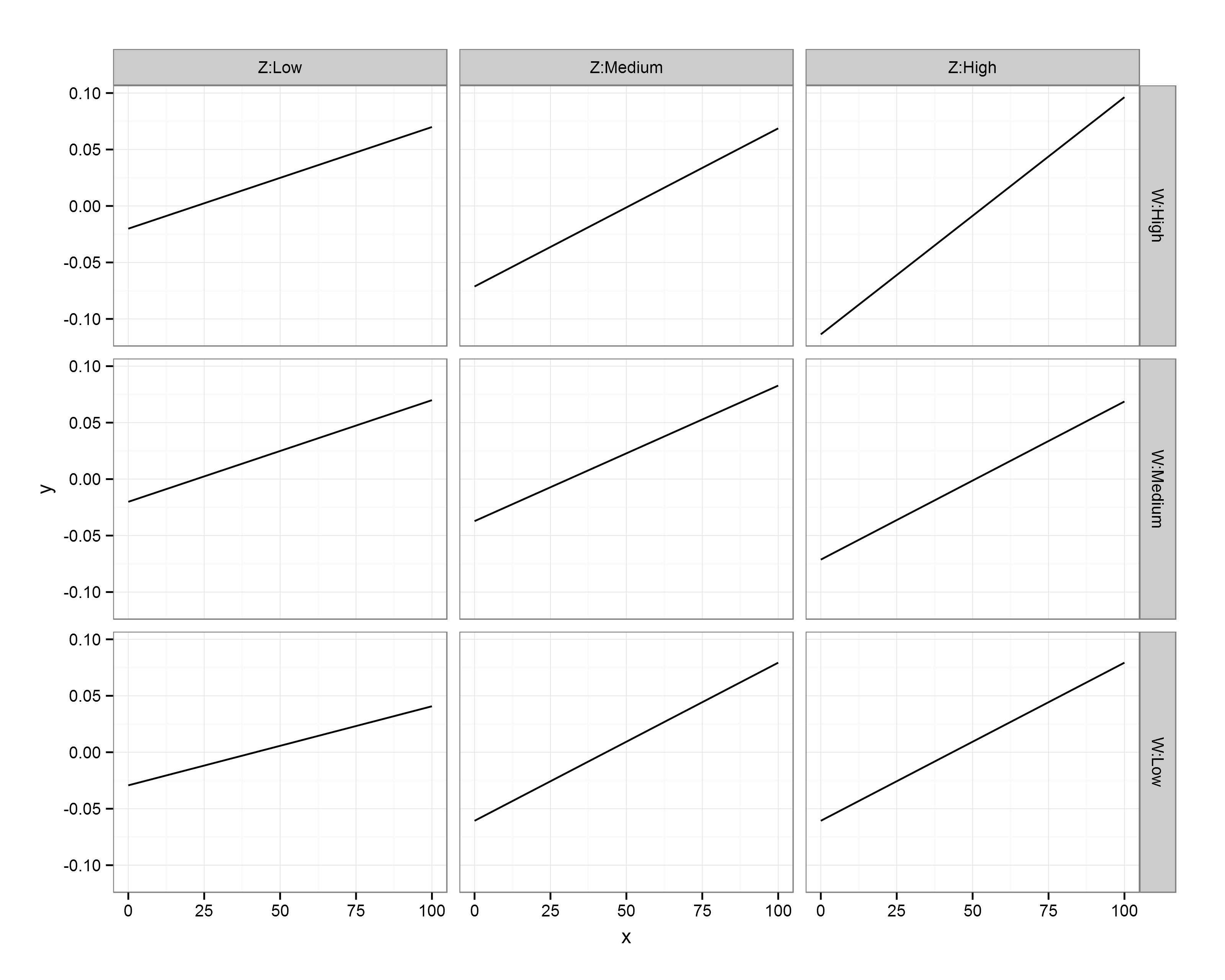
I had a comment underneath from someone who had a similar problem, but where the interacting variables consisted of a single continuous and 2 categorical variables (rather than 3 continuous variables). Given that we have distinct levels for the modifier variables Z and W then our job is made a little easier, as the analysis provides coefficients for every main effect and interaction. However, each of the categorical modifier variables here has 3 levels, giving 9 different combinations of Y ~ X. While we could take the same approach as last time (creating predicted slopes and plotting them on a single figure), that wouldn’t produce a very intuitive figure. Instead, let’s use ggplot2’s excellent ‘facets‘ function to produce multiple figures within a larger one.
This approach is termed ‘small multiples’, a term popularised by statistician and data visualisation guru Edward Tufte. I’ll hand it over to him to describe the thinking behind it:
“Illustrations of postage-stamp size are indexed by category or a label, sequenced over time like the frames of a movie, or ordered by a quantitative variable not used in the single image itself. Information slices are positioned within the eyespan, so that viewers make comparisons at a glance — uninterrupted visual reasoning. Constancy of design puts the emphasis on changes in data, not changes in data frames.”
Each small figure should have the same measures and scale; once you’ve understood the basis of the first figure, you can then move across the others and see how it responds to changes in a third variable (and then a fourth…). The technique is particularly useful for multivariate data because you can compare and contrast changes between the main relationship of interest (Y ~ X) as the values of other variables (Z, W) change. Sounds complex, but it’s really very simple and intuitive, as you’ll see below!
Ok, so the commenter on my previous post included the regression coefficients from her mixed model analysis that was specified as lmer(Y ~ X*Z*W+(1|PPX),data=Matrix). W and Z each have 3 levels: low, medium, and high, but these are to be treated as categorical rather than continuous – i.e., we get coefficients for each level. We’ll also disregard the random effects here, as we’re interested in plotting only the main effects.
I don’t have the raw data, so I’m simply going to plot the predicted slopes on values of X from 0 to 100; I’m first going to make this sequence, and enter all my coefficients as variables:
The reference values are Low Z and Low W; you can see that we only have coefficients for Medium/High values of these variables, so they are offset from the reference slope. The underscore in my variable names denotes an interaction; when X is involved then it’s an effect on the slope of Y on X, whereas otherwise it affects the intercept.
Let’s go ahead and predict Y values for each value of X when Z and W are both Low (i.e., using the global intercept and the coefficient for the effect of X on Y):
y.WL_ZL <- int_global + (x * X_coef)

df.WL_ZL <- data.frame(x = x,
                       W = "W:Low",
                       Z = "Z:Low",
                       y = y.WL_ZL)
Now, let’s change a single variable, and plot Y on X when Z is at ‘Medium’ level (still holding W at ‘Low’):
# Change Z

y.WL_ZM <- int_global + ZMedium + (x * X_coef) + (x * X_ZMedium)

df.WL_ZM <- data.frame(x = x,
                       W = "W:Low",
                       Z = "Z:Medium",
                       y = y.WL_ZM)
Remember, because the coefficients of Z/W are offsets, we add these effects on top of the reference levels. You’ll notice that I specified the level of Z and W as ‘Z:Low’ and ‘W:Low’; while putting the variable name in the value is redundant, you’ll see later why I’ve done this.
We can go ahead and make mini data frames for each of the different interactions:
Ok, so we now have a mini data frame giving predicted values of Y on X for each combination of Z and W. Not the most elegant solution, but fine for our purposes! Let’s go ahead and concatenate these data frames into one large one, and throw away the individual mini frames:
First, I call the ggplot2 library. The main function call to ggplot specifies our data frame (df.XWZ), and the variables to be plotted (x,y). Then, ‘geom_line()‘ indicates that I want the observations to be connected by lines. Next, ‘facet_grid‘ asks for this figure to be laid out in a grid of panels; ‘W~Z’ specifies that these panels are to be laid out in rows for values of W and columns for values of Z. Setting ‘as.table’ to FALSE simply means that the highest level of W is at the top, rather than the bottom (as would be the case if it were laid out in table format, but as a figure I find it more intuitive to have the highest level at the top). Finally, ‘theme_bw()’ just gives a nice plain theme that I prefer to ggplot2’s default settings.
There we have it! A small multiples plot to show the results of a multiple regression analysis, with each panel showing the relationship between our response variable (Y) and continuous predictor (X) for a unique combination of our 3-level moderators (Z, W).
You’ll notice here that the facet labels have things like ‘Z:Low’ etc in them, which I coded into the data frames. This is purely because ggplot2 doesn’t automatically label the outer axes (i.e., as Z, W), and I find this easier than remembering which variable I’ve defined as rows/columns…
Hopefully this is clear – any questions, please leave a comment. The layout of R script was created by Pretty R at inside-R.org. Thanks again to Rebekah for her question on my previous post, and letting me use her analysis as an example here.
—-
Want to know more about understanding and visualising interactions in multiple linear regression? Check out my related posts:
A quick note here to say that I shall be helping my PhD supervisor, Luc Bussière, teach a week-long workshop entitled ‘Advancing in R’ at the SCENE field station (on the bonny, bonny banks of Loch Lomond) in December. The course is aimed at biologists who have a basic to moderate knowledge of using R for statistics programming, and is designed to bridge the gap between basic R coding and advanced statistical modelling. Here is a list of the modules to be covered during the week:
Module 1: Introduction & data visualization using (graphics) and (ggplot2)
Module 2: Univariate regression, diagnostics & plotting fits
Module 3: Adding additional continuous predictors (multiple regression); scaling & collinearity
Module 4: Adding factorial (categorical) predictors & incorporating interactions (ANCOVA)
Module 5: Model selection & simplification (likelihood ratio tests, AIC)
Module 6: Mixed effects models in theory & practice
Module 7: Generalised Linear Models (binomial and count data)
Module 8: Nonlinear models (polynomial & mechanistic models)
Module 9: Combining methods (e.g., nonlinear mixed effect (NLME) models & generalised linear mixed effect (GLMM) models)
Module 10: One-on-one consultations/other advanced topics