Category Archives: Stats

New paper: Testing the stability of behavioural coping style across stress contexts in the Trinidadian guppy

My first empirical work from my postdoc with Alastair Wilson is out now in Functional Ecology (open access). We take a pretty deep dive into analysing individual variation in behavioural plasticity, including comparing multivariate among-individual behaviour across contexts, testing for a single underlying axis of variation, etc. The supplementary information also includes some R code showing how we did the main analyses, and the dataset is available on Dryad.

This paper also got a lot of traction in the popular press due to us showing that guppy ‘personality’ (i.e., consistent individual differences in behaviour) exists, is more complex than might have been thought, and persists across different stressors (which had large effects on the average behaviour in the population). Some of the articles are linked in my Media & Outreach page, and the video of my interview on BBC World News is embedded below.


Advertisement

New paper: ‘Avoiding the misuse of BLUP in behavioural ecology’

I have a new paper (with Alastair Wilson) out in the Behavioural Ecology journal, entitled ‘Avoiding the misuse of BLUP in behavioural ecology‘. Our paper is aimed at researchers working on individual variation in behaviour (e.g., personality, behavioural plasticity, behavioural syndromes), particularly those wishing to investigate associations between that behavioural variation and some other trait or variable (e.g., another behaviour, a physiological response, or even some external environmental variable). The thrust of the paper is really a call to ensure that we are using the proper statistical tools to test our hypotheses, rather than using other approaches that are known to give spurious results. The paper is quite brief, and can be found here (or drop me an email if you require a reprint).

Of course, pointing out problems is in itself not hugely useful without solutions being to hand, and so we have provided these in the form of tutorials for multivariate models in the programming language R. We are still working up more tutorials to cover more of the kinds of issues in which people are interested, so do keep checking back for updates – and let me know if there are any other relevant topics that you’d like to see covered! As has been pointed out on twitter, while we focused on animal behaviour because we work in that field, these models are applicable to many other fields in which researchers are interested in the causes and consequences of variation in labile traits.

NOTE

It has been pointed out to me (post-publication) that the Adriaenssens et al. (2016) paper in Physiology & Behavior, ‘Telomere length covaries with personality in a wild brown trout‘, did not use BLUPs extracted from mixed models in a secondary analysis, and is therefore incorrectly included in Table 1 of our Behavioural Ecology paper. I have apologised to Bart for my error, and contacted the publishers to see whether this reference can be removed from the paper.

New paper: Food supply – not ‘live fast, die young’ mentality – makes male crickets chirpy

I have a new paper out in the journal Functional Ecology, entitled ‘Mating opportunities and energetic constraints drive variation in age-dependent sexual signalling‘. This is work from my PhD with Luc Bussière at Stirling, along with collaborators from the University of Exeter’s Cornwall campus (where I’m currently based).

We used dietary manipulations as well as manipulation of potential mate availability to investigate how male sexual signalling changes with current budget and previous expenditure. We found some cool results about what causes variation in age-dependent sexual signalling – these have implications for ‘honesty’ in sexual displays, and are also a nice reminder that there are simpler explanations than we (as humans, who love seeing patterns in the noise) often cling to.

Our paper also includes a nice example of using ‘zero-altered’ statistical models, enabling us to partition out effects on why males call from the effects on how long they call.

You can find the paper here, or email me for a PDF if you don’t have access to the journal.

Alternatively, the press office at Exeter put together a nice press release, which I’ve pasted below:


Shedding a few pounds might be a good strategy in the human dating game, but for crickets the opposite is true.

Well-fed male crickets make more noise and mate with more females than their hungry counterparts, according to research by the universities of Exeter and Stirling.

It has long been believed that males who acquire ample food can adopt a “live fast, die young” strategy – burning energy by calling to attract females as soon as they are able, at the expense of longevity – while rivals with poorer resource budgets take a “slow and steady” approach, enabling them to save resources and take advantage of their savings later in the season.

But the researchers found that increased diet – rather than any strategic decision by the cricket – led the best-provisioned crickets to chirp for longer. This had no noticeable cost to their lifespan.

Meanwhile hungrier males not only signalled less – meaning fewer female visitors – but also died younger.

Senior author Dr Luc Bussière, of the University of Stirling, said the findings offered a “simpler alternative” to understanding the behaviour of crickets.

“While it was intriguing to think that males might foresee and plan for their future reproductive prospects by strategically staying quiet, what our experiment suggests is actually easier to understand: rather than relying on an ability to forecast the future, crickets appear instead to respond mainly to the resources they have in hand,” he said.

Male crickets signal to females using an energetically expensive call, produced by rubbing together their hardened forewings.

The more time they spend calling, the more mates they attract.

The paper, published in Functional Ecology, studied decorated crickets, which mate about once a day on average during their month-long adult life.

Males need a three-hour recovery period following each mating to build a new sperm package, after which they are able to call again in the hopes of attracting another female.

Researchers found that a male cricket’s decision about whether to call was primarily based on whether females were nearby – rather than how well-fed they were – but the better-nourished males were able to call for longer and thus increase their mating prospects.

The study also provides insights into how energy budgets keep male displays honest for choosy females over the course of the mating season.

“In nature, a ‘better quality’ male will likely have better access to resources,” said lead author Dr Tom Houslay, a Postdoctoral Research Associate at the University of Exeter.

“Low-quality males might be able to ‘cheat’ by calling a lot one day, making females think they are high-quality, but this is not sustainable – so there is ‘honesty on average’.

“A female may be fooled once or twice, but over time males with more energy will call more – meaning females should tend to make the ‘correct’ decision by preferring those males.”

ISBE Plasticity Tutorial

Skip the chat and go straight to the code: ISBE Plasticity Tutorial

I’ve just about recovered from an excellent time at the 16th congress of the International Society for Behavioral Ecology (ISBE), where I saw a ton of cool science, caught up with loads of friends, and learned (and drank, and ate) a lot! I also gave my first talk on the work I’ve been doing in my postdoc with Alastair Wilson – hopefully I can figure out how to share my slides on here at some point – which seemed to go over reasonably well.

At the end of the conference there were various symposia, and I went to one on ‘The Causes and Consequences of Behavioural Plasticity‘ (organised by Suzanne Alonzo and Nick Royle). I had some code I’d made for a previous workshop in our department, so gave a quick tutorial on how to model plasticity (in particular, among-individual differences in plasticity) in R. Unfortunately the licence servers for ASreml had gone down until an hour before lunch, so I didn’t end up showing the multivariate modelling (also turns out I’d forgotten how hard it is to present something in any kind of charismatic fashion when you are scrolling through code and haven’t really had any sleep)… but I have gathered together the code for modelling individual differences in plasticity in both a ‘reaction norm’ (random regression) and ‘character state’ (multivariate modelling) framework at the link:

-> -> ISBE Plasticity Tutorial <- <-

Any comments / suggestions very welcome – just fire me an email, or contact me on twitter! I’m currently working on the manuscript for the work I showed at ISBE, which involved using multivariate models, matrix comparisons etc to figure out the plasticity of personality structure over different contexts – the code (and data) will be made available when the paper is out…

A quick, very unsubtle plug: bookings are now being taken for the next Advancing in R workshop run by PR Statistics (taught by Luc Bussière, with me as glamorous assistant), where we cover data wrangling, visualisation, and regression models from simple linear regression up to random regression. We will also teach the ‘ADF method’ for your statistical modelling workflow – hopefully also to be immortalised in a paper at some point!

Update 1

I have been reminded to stress a very important point…


Update 2

One of the comments I received on this was from Luis Apiolaza, he of quantitative genetics, forestry, and many excellent ASreml-r blog posts. He noted that – had he been writing such a tutorial – he would typically have started from the multivariate approach, and extended to random regression from there (citing a recent study in which they had 80+ sites/traits). I think this is a good point to make, in particular the realisation that it’s very easy to just think about our own studies (as I was doing).

My work is usually in the laboratory, so I’m likely to have a small number of traits / controlled environments that I’ve observed. In these cases, while reaction norms are easy to draw and to think about, modelling the data as character states actually provides me with more useful information. I am also aware that – in ecology and evolution – random regression models have been pushed quite hard, to the extent that it’s seen almost as a ‘one size fits all’ solution, and people are often unaware of the relative advantages of character state models. However, they are not always suitable for the data: it may be that there are too many traits/environments to estimate all the variances and covariances, or – as in another study I’m involved with – the repeated measurements of an individual are taken on an environmental gradient, but it is not possible to control the exact points on that gradient. In that case, of course, we can use random regression to estimate differences in plasticity using all of our data, and convert the intercept-slope covariance matrix to character state for specific values of our environmental predictor if we want to look at relative variation.

I’m not convinced there’s truly a ‘right answer’, rather that it’s nice to have the option of both types of models, and to know the relative advantages / disadvantages of each…

‘Beyond bar and line graphs’

I came across an interesting paper earlier on data visualisation – published last year in Plos One, Weissgerber et al set out reasons why bar or line graphs can be misleading when presenting continuous data. It’s well worth a read:

Weissgerber TL, Milic NM, Winham SJ, Garovic VD (2015) Beyond Bar and Line Graphs: Time for a New Data Presentation Paradigm. PLoS Biol 13(4):e1002128. doi: 10.1371/journal.pbio.1002128

The authors also provide some Excel templates in the supplementary information for creating figures that are more useful than bar or line graphs, including scatterplots, paired plots, etc. I have taken their data and created those plots in ggplot2 (using some dplyr and knitr magic to make the data usable), and published that code over at RStudio’s excellent ‘Rpubs’ resource. Check it out here:

http://rpubs.com/tomhouslay/beyond-bar-line-graphs


Of carts and horses

I have been working on a post for some time now, in which I was planning to use web-scraping in R to gather sports-related data from webpages and then run some fancy analysis on it. But when I say ‘working on’, I mean that I’ve playing around with the data, staring at a whole bunch of exploratory plots, and trying to come up with an angle for the analysis.

And, so far, I’ve come up with: nothing.

But perhaps some good can come out of this. The process of trying to come up with an idea to fit the data reminded me of this quote by Sir Ronald Fisher (I should admit that I know of the quote because a guy on the R mixed models mailing list has it in his signature):

To call in the statistician after the experiment is done may be no more than asking him to perform a post-mortem examination: he may be able to say what the experiment died of.

In the past couple of years, I’ve started teaching week-long statistics workshops (*cough*), which are incredibly satisfying (if also incredibly draining!). I have also gone through that enlightening period where learning a little more makes you realise how much you don’t know, which opened up a whole slew of new things to learn (also, I have started listening to statistics-related podcasts, which possibly means that I need professional help). I’m lucky in that I’ve managed to figure out some of this stuff, which leads to other people now coming to me for help with their analysis. Questions range from ‘does my model look ok?’ all the way to ‘I have this data, how should I analyse it?’. The latter always brings that quote into sharper focus.

It’s for this reason, the idea that statistical analysis should be an intrinsic part of the planning of any project, that I was interested to read articles recently on the idea of registering studies with journals prior to gathering the data. This idea stems mainly from the fact that too much of whether something gets published depends on it being a positive result, and the ‘spin’ of the results – with hypotheses often dreamed up post-hoc – affects which journal the study gets published in (obviously there’s more nuance than that, but maybe not that much more). By registering the design beforehand, you can go to a journal and say: this is the question, here are our hypotheses, here’s how we’re going to tackle it with an experiment, and here’s how we will analyse the data. The journal would then decide beforehand if they think that’s worth publishing – whatever the result.

This is a little simplistic, of course – there would have to be the usual review process, and there would obviously be leeway for further analysis of interesting trends on a post-hoc basis – but it would enforce greater thinking about an analysis strategy prior to embarking on a study. Even the simple task of drawing out the potential figures that would come out of the data collection is crucial to the process, as they help to clarify what is actually being tested.

So – that post I was originally setting out to write? I have the data, but I still haven’t had any good ideas for how to use it. And maybe it’s that kind of backwards approach that we all need to stay away from.

Further reading:

Nature: ‘Registered clinical trials make positive findings vanish

Kaplan & Irvin (2015) Plos One: ‘Likelihood of Null Effects of Large NHLBI Clinical Trials Has Increased over Time

The Guardian: ‘Trust in science would be improved by study pre-registration

The Washington Post: ‘How to make scientific research more trustworthy

New York Times: ‘To get more out of science, show the rejected research

FiveThirtyEight: ‘Science isn’t broken‘ (This is a must-read)

My favourite statistics podcasts!

Not so standard deviations

FiveThirtyEight’s ‘What’s the point?’

Understanding 3-way interactions between continuous and categorical variables, part ii: 2 cons, 1 cat

I posted recently (well… not that recently, now that I remember that time is linear) about how to visualise 3-way interactions between continuous and categorical variables (using 1 continuous and 2 categorical variables), which was a follow-up to my extraordinarily successful post on 3-way interactions between 3 continuous variables (by ‘extraordinarily successful’, I mean some people read it on purpose and not because they were misdirected by poorly-thought google search terms, which is what happens with the majority of my graphic insect-sex posts). I used ‘small multiples‘, and also predicting model fits when holding particular variables at distinct values.

ANYWAY…

I just had a comment on the recent post, and it got me thinking about combining these approaches:

Screen Shot 2015-06-02 at 17.32.18

There are a number of approaches we can use here, so I’ll run through a couple of examples. First, however, we need to make up some fake data! I don’t know anything about bone / muscle stuff (let’s not delve too far into what a PhD in biology really means), so I’ve taken the liberty of just making up some crap that I thought might vaguely make sense. You can see here that I’ve also pretended we have a weirdly complete and non-overlapping set of data, with one observation of bone for every combination of muscle (continuous predictor), age (continuous covariate), and group (categorical covariate). Note that the libraries you’ll need for this script include {dplyr}, {broom}, and {ggplot2}.

#### Create fake data ####
 
bone_dat <- data.frame(expand.grid(muscle = seq(50,99),
                                   age = seq(18, 65),
                                   groupA = c(0, 1)))
 
## Set up our coefficients to make the fake bone data
coef_int <- 250
coef_muscle <- 4.5
coef_age <- -1.3
coef_groupA <- -150
coef_muscle_age <- -0.07
coef_groupA_age <- -0.05
coef_groupA_muscle <- 0.3
coef_groupA_age_muscle <- 0.093
 
bone_dat <- bone_dat %>% 
  mutate(bone = coef_int +
  (muscle * coef_muscle) +
  (age * coef_age) +
  (groupA * coef_groupA) +
  (muscle * age * coef_muscle_age) +
  (groupA * age * coef_groupA_age) +
  (groupA * muscle * coef_groupA_muscle) +
  (groupA * muscle * age * coef_groupA_age_muscle))
 
ggplot(bone_dat,
       aes(x = bone)) +
  geom_histogram(color = 'black',
                 fill = 'white') +
  theme_classic() +
  facet_grid(. ~ groupA)
 
## Add some random noise
noise <- rnorm(nrow(bone_dat), 0, 20)
bone_dat$bone <- bone_dat$bone + noise
 
#### Analyse ####
 
mod_bone <- lm(bone ~ muscle * age * groupA,
               data = bone_dat)
 
plot(mod_bone)

summary(mod_bone)

While I’ve added some noise to the fake data, it should be no surprise that our analysis shows some extremely strong effects of interactions… (!)


Call:
lm(formula = bone ~ muscle * age * groupA, data = bone_dat)

Residuals:
Min 1Q Median 3Q Max
-71.824 -13.632 0.114 13.760 70.821

Coefficients:
Estimate Std. Error t value Pr(>|t|)
(Intercept) 2.382e+02 6.730e+00 35.402 < 2e-16 ***
muscle 4.636e+00 8.868e-02 52.272 < 2e-16 ***
age -9.350e-01 1.538e-01 -6.079 1.31e-09 ***
groupA -1.417e+02 9.517e+00 -14.888 < 2e-16 ***
muscle:age -7.444e-02 2.027e-03 -36.722 < 2e-16 ***
muscle:groupA 2.213e-01 1.254e-01 1.765 0.0777 .
age:groupA -3.594e-01 2.175e-01 -1.652 0.0985 .
muscle:age:groupA 9.632e-02 2.867e-03 33.599 < 2e-16 ***

Signif. codes: 0 ‘***’ 0.001 ‘**’ 0.01 ‘*’ 0.05 ‘.’ 0.1 ‘ ’ 1

Residual standard error: 19.85 on 4792 degrees of freedom
Multiple R-squared: 0.9728, Adjusted R-squared: 0.9728
F-statistic: 2.451e+04 on 7 and 4792 DF, p-value: < 2.2e-16

(EDIT: Note that this post is only on how to visualise the results of your analysis; it is based on the assumption that you have done the initial data exploration and analysis steps yourself already, and are satisfied that you have the correct final model… I may write a post on this at a later date, but for now I’d recommend Zuur et al’s 2010 paper, ‘A protocol for data exploration to avoid common statistical problems‘. Or you should come on the stats course that Luc Bussière and I run).

Checking the residuals etc indicates (to nobody’s surprise) that everything is looking pretty glorious from our analysis. But how to actually interpret these interactions?

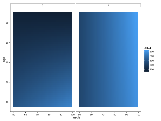
We shall definitely have to use small multiples, because otherwise we shall quickly become overwhelmed. One method is to use a ‘heatmap’ style approach; this lets us plot in the style of a 3D surface, where our predictors / covariates are on the axes, and different colour regions within parameter space represent higher or lower values. If this sounds like gibberish, it’s really quite simple to get when you see the plot:

heatmap

Here, higher values of bone are in lighter shades of blue, while lower values of bone are in darker shades. Moving horizontally, vertically or diagonally through combinations of muscle and age show you how bone changes; moreover, you can see how the relationships are different in different groups (i.e., the distinct facets).

To make this plot, I used one of my favourite new packages, ‘{broom}‘, in conjunction with the ever-glorious {ggplot2}. The code is amazingly simple, using broom’s ‘augment’ function to get predicted values from our linear regression model:

mod_bone %>% augment() %>% 
  ggplot(., aes(x = muscle,
                y = age,
                fill = .fitted)) +
  geom_tile() +
  facet_grid(. ~ groupA) +
  theme_classic()

But note that one aspect of broom is that augment just adds predicted values (and other cool stuff, like standard errors around the prediction) to your original data frame. That means that if you didn’t have such a complete data set, you would be missing predicted values because you didn’t have those original combinations of variables in your data frame. For example, if we sample 50% of the fake data, modelled it in the same way and plotted it, we would get this:

heatmap_samp

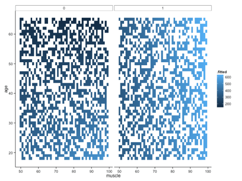
Not quite so pretty. There are ways around this (e.g. using ‘predict’ to fill all the gaps), but let’s move onto some different ways of visualising the data – not least because I still feel like it’s a little hard to get a handle on what’s really going on with these interactions.

A trick that we’ve seen before for looking at interactions between continuous variables is to look at only high/low values of one, across the whole range of another: in this case, we would show how bone changes with muscle in younger and older people separately. We could then use small multiples to view these relationships in distinct panels for each group (ethnic groups, in the example provided by the commenter above).

Here, I create a fake data set to use for predictions, where I have the full range of muscle (50:99), the full range of groups (0,1), and then age is at 1 standard deviation above or below the mean. The ‘expand.grid’ function simply creates every combination of these values for us! I use ‘predict’ to create predicted values from our linear model, and then add an additional variable to tell us whether the row is for a ‘young’ or ‘old’ person (this is really just for the sake of the legend):

#### Plot high/low values of age covariate ####
 
bone_pred <- data.frame(expand.grid(muscle = seq(50, 99),
                      age = c(mean(bone_dat$age) +
                                sd(bone_dat$age),
                              mean(bone_dat$age) -
                                sd(bone_dat$age)),
                      groupA = c(0, 1)))
 
bone_pred <- cbind(bone_pred,
                   predict(mod_bone,
                     newdata = bone_pred,
                     interval = "confidence"))
 
bone_pred <- bone_pred %>% 
  mutate(ageGroup = ifelse(age > mean(bone_dat$age), "Old", "Young"))
 
 
ggplot(bone_pred, 
       aes(x = muscle,
           y = fit)) +
  geom_line(aes(colour = ageGroup)) +
#   geom_point(data = bone_dat,
#              aes(x = muscle,
#                  y = bone)) +
  facet_grid(. ~ groupA) +
  theme_classic()

This gives us the following figure:

interaction_1

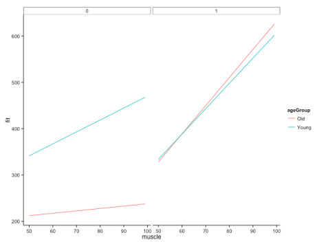
Here, we can quite clearly see how the relationship between muscle and bone depends on age, but that this dependency is different across groups. Cool! This is, of course, likely to be more extreme than you would find in your real data, but let’s not worry about subtlety here…

You’ll also note that I’ve commented out some lines in the specification of the plot. These show you how you would plot your raw data points onto this figure if you wanted to, but it doesn’t make a whole lot of sense here (as it would include all ages), and also our fake data set is so dense that it just obscures meaning. Good to have in your back pocket though!

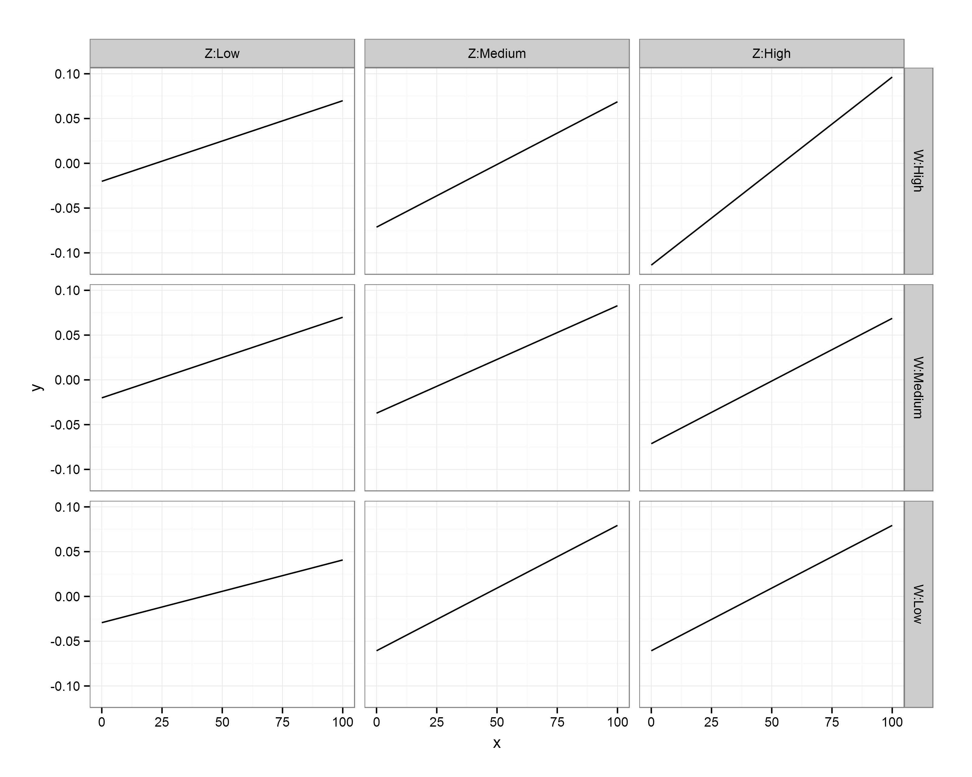
Finally, what if we were more concerned with comparing the bone:muscle relationship of different groups against each other, and doing this at distinct ages? We could just switch things around, with each group a line on a single panel, with separate panels for ages. Just to make it interesting, let’s have three age groups this time: young (mean – 1SD), average (mean), old (mean + 1SD):

#### Groups on a single plot, with facets for different age values ####
 
avAge <- round(mean(bone_dat$age))
sdAge <- round(sd(bone_dat$age))
youngAge <- avAge - sdAge
oldAge <- avAge + sdAge
 
bone_pred2 <- data.frame(expand.grid(muscle = seq(50, 99),
                                      age = c(youngAge,
                                              avAge,
                                              oldAge),
                                      groupA = c(0, 1)))
 
bone_pred2 <- cbind(bone_pred2,
                   predict(mod_bone,
                           newdata = bone_pred2,
                           interval = "confidence"))
 
ggplot(bone_pred2, 
       aes(x = muscle,
           y = fit,
           colour = factor(groupA))) +
  geom_line() +
  facet_grid(. ~ age) +
  theme_classic()

Created by Pretty R at inside-R.org

The code above gives us:

interaction_2

Interestingly, I think this gives us the most insightful version yet. Bone increases with muscle, and does so at a higher rate for those in group A (i.e., group A == 1). The positive relationship between bone and muscle diminishes at higher ages, but this is only really evident in non-A individuals.

Taking a look at our table of coefficients again, this makes sense:


Coefficients:
Estimate Std. Error t value Pr(>|t|)
(Intercept) 2.382e+02 6.730e+00 35.402 < 2e-16 ***
muscle 4.636e+00 8.868e-02 52.272 < 2e-16 ***
age -9.350e-01 1.538e-01 -6.079 1.31e-09 ***
groupA -1.417e+02 9.517e+00 -14.888 < 2e-16 ***
muscle:age -7.444e-02 2.027e-03 -36.722 < 2e-16 ***
muscle:groupA 2.213e-01 1.254e-01 1.765 0.0777 .
age:groupA -3.594e-01 2.175e-01 -1.652 0.0985 .
muscle:age:groupA 9.632e-02 2.867e-03 33.599 < 2e-16 ***
---
Signif. codes: 0 ‘***’ 0.001 ‘**’ 0.01 ‘*’ 0.05 ‘.’ 0.1 ‘ ’ 1


There is a positive interaction between group A x muscle x bone, which – in group A individuals – overrides the negative muscle x age interaction. The main effect of muscle is to increase bone mass (positive slope), while the main effect of age is to decrease it (in this particular visualisation, you can see this because there is essentially an age-related intercept that decreases along the panels).

These are just a few of the potential solutions, but I hope they also serve to indicate how taking the time to explore options can really help you figure out what’s going on in your analysis. Of course, you shouldn’t really believe these patterns if you can’t see them in your data in the first place though!

Unfortunately, I can’t help our poor reader with her decision to use Stata, but these things happen…

Note: if you like this sort of thing, why not sign up for the ‘Advancing in statistical modelling using R‘ workshop that I teach with Luc Bussière? Not only will you learn lots of cool stuff about regression (from straightforward linear models up to GLMMs), you’ll also learn tricks for manipulating and tidying data, plotting, and visualising your model fits! Also, it’s held on the bonny banks of Loch Lomond. It is delightful.

—-

Want to know more about understanding and visualising interactions in multiple linear regression? Check out my previous posts:

Understanding three-way interactions between continuous variables

Using small multiples to visualise three-way interactions between 1 continuous and 2 categorical variables

Understanding 3-way interactions between continuous and categorical variables: small multiples

It can be pretty tricky to interpret the results of statistical analysis sometimes, and particularly so when just gazing at a table of regression coefficients that include multiple interactions. I wrote a post recently on visualising these interactions when variables are continuous; in that instance, I computed the effect of X on Y when the moderator variables (Z, W) are held constant at high and low values (which I set as +/- 1 standard deviation from the mean). This gave 4 different slopes to visualise: low Z & low W, low Z & high W, high Z & low W, and high Z & high W. It was simple enough to plot these on a single figure and see what effect the interaction of Z and W had on the relationship between Y and X.

gg_ints

I had a comment underneath from someone who had a similar problem, but where the interacting variables consisted of a single continuous and 2 categorical variables (rather than 3 continuous variables). Given that we have distinct levels for the modifier variables Z and W then our job is made a little easier, as the analysis provides coefficients for every main effect and interaction. However, each of the categorical modifier variables here has 3 levels, giving 9 different combinations of Y ~ X. While we could take the same approach as last time (creating predicted slopes and plotting them on a single figure), that wouldn’t produce a very intuitive figure. Instead, let’s use ggplot2’s excellent ‘facets‘ function to produce multiple figures within a larger one.

This approach is termed ‘small multiples’, a term popularised by statistician and data visualisation guru Edward Tufte. I’ll hand it over to him to describe the thinking behind it:

“Illustrations of postage-stamp size are indexed by category or a label, sequenced over time like the frames of a movie, or ordered by a quantitative variable not used in the single image itself. Information slices are positioned within the eyespan, so that viewers make comparisons at a glance — uninterrupted visual reasoning. Constancy of design puts the emphasis on changes in data, not changes in data frames.”

–Edward Tufte, ‘Envisioning Information

Each small figure should have the same measures and scale; once you’ve understood the basis of the first figure, you can then move across the others and see how it responds to changes in a third variable (and then a fourth…). The technique is particularly useful for multivariate data because you can compare and contrast changes between the main relationship of interest (Y ~ X) as the values of other variables (Z, W) change. Sounds complex, but it’s really very simple and intuitive, as you’ll see below!

Ok, so the commenter on my previous post included the regression coefficients from her mixed model analysis that was specified as lmer(Y ~ X*Z*W+(1|PPX),data=Matrix). W and Z each have 3 levels: low, medium, and high, but these are to be treated as categorical rather than continuous – i.e., we get coefficients for each level. We’ll also disregard the random effects here, as we’re interested in plotting only the main effects.

I don’t have the raw data, so I’m simply going to plot the predicted slopes on values of X from 0 to 100; I’m first going to make this sequence, and enter all my coefficients as variables:

x <- seq(-100, 100)
 
int_global <- 	-0.0293
X_coef	<- 0.0007
WHigh <-	-0.0357
WMedium <-	0.0092
ZHigh <-	-0.0491
ZMedium <-	-0.0314
X_WHigh <-	0.0007
X_WMedium <-	0.0002
X_ZHigh <-	0.0009
X_ZMedium <-	0.0007
WHigh_ZHigh <-	0.0004
WMedium_ZHigh <-	-0.0021
WHigh_ZMedium <-	-0.0955
WMedium_ZMedium <-	0.0143
X_WHigh_ZHigh <- -0.0002
X_WMedium_ZHigh <-	-0.0004
X_WHigh_ZMedium <-	0.0013
X_WMedium_ZMedium <-	-0.0004

The reference values are Low Z and Low W; you can see that we only have coefficients for Medium/High values of these variables, so they are offset from the reference slope. The underscore in my variable names denotes an interaction; when X is involved then it’s an effect on the slope of Y on X, whereas otherwise it affects the intercept.

Let’s go ahead and predict Y values for each value of X when Z and W are both Low (i.e., using the global intercept and the coefficient for the effect of X on Y):

y.WL_ZL <- int_global + (x * X_coef)
 
df.WL_ZL <- data.frame(x = x,
                       W = "W:Low",
                       Z = "Z:Low",
                       y = y.WL_ZL)

Now, let’s change a single variable, and plot Y on X when Z is at ‘Medium’ level (still holding W at ‘Low’):

# Change Z
 
y.WL_ZM <- int_global + ZMedium + (x * X_coef) + (x * X_ZMedium)
 
df.WL_ZM <- data.frame(x = x,
                       W = "W:Low",
                       Z = "Z:Medium",
                       y = y.WL_ZM)

Remember, because the coefficients of Z/W are offsets, we add these effects on top of the reference levels. You’ll notice that I specified the level of Z and W as ‘Z:Low’ and ‘W:Low’; while putting the variable name in the value is redundant, you’ll see later why I’ve done this.

We can go ahead and make mini data frames for each of the different interactions:

y.WL_ZH <- int_global + ZHigh + (x * X_coef) + (x * X_ZHigh)
 
df.WL_ZH <- data.frame(x = x,
                       W = "W:Low",
                       Z = "Z:High",
                       y = y.WL_ZM)
 
# Change W
 
y.WM_ZL <- int_global + WMedium + (x * X_coef) + (x * X_WMedium)
 
df.WM_ZL <- data.frame(x = x,
                       W = "W:Medium",
                       Z = "Z:Low",
                       y = y.WM_ZL)
 
y.WH_ZL <- int_global + WHigh + (x * X_coef) + (x * X_WHigh)
 
df.WH_ZL <- data.frame(x = x,
                       W = "W:High",
                       Z = "Z:Low",
                       y = y.WM_ZL)
 
# Change both
 
y.WM_ZM <- int_global + WMedium + ZMedium + WMedium_ZMedium + 
  (x * X_coef) + 
  (x * X_ZMedium) +
  (x * X_WMedium) +
  (x * X_WMedium_ZMedium)
 
 
df.WM_ZM <- data.frame(x = x,
                       W = "W:Medium",
                       Z = "Z:Medium",
                       y = y.WM_ZM)
 
 
y.WM_ZH <- int_global + WMedium + ZHigh + WMedium_ZHigh + 
  (x * X_coef) + 
  (x * X_ZHigh) +
  (x * X_WMedium) +
  (x * X_WMedium_ZHigh)
 
 
df.WM_ZH <- data.frame(x = x,
                       W = "W:Medium",
                       Z = "Z:High",
                       y = y.WM_ZH)
 
 
y.WH_ZM <- int_global + WHigh + ZMedium + WHigh_ZMedium + 
  (x * X_coef) + 
  (x * X_ZMedium) +
  (x * X_WHigh) +
  (x * X_WHigh_ZMedium)
 
 
df.WH_ZM <- data.frame(x = x,
                       W = "W:High",
                       Z = "Z:Medium",
                       y = y.WM_ZH)
 
 
y.WH_ZH <- int_global + WHigh + ZHigh + WHigh_ZHigh + 
  (x * X_coef) + 
  (x * X_ZHigh) +
  (x * X_WHigh) +
  (x * X_WHigh_ZHigh)
 
 
df.WH_ZH <- data.frame(x = x,
                       W = "W:High",
                       Z = "Z:High",
                       y = y.WH_ZH)

Ok, so we now have a mini data frame giving predicted values of Y on X for each combination of Z and W. Not the most elegant solution, but fine for our purposes! Let’s go ahead and concatenate these data frames into one large one, and throw away the individual mini frames:

# Concatenate data frames
df.XWZ <- rbind(df.WL_ZL,
                df.WM_ZL,
                df.WH_ZL,
                df.WL_ZM,
                df.WL_ZH,
                df.WM_ZM,
                df.WM_ZH,
                df.WH_ZM,
                df.WH_ZH)
 
# Remove individual frames
rm(df.WL_ZL,
   df.WM_ZL,
   df.WH_ZL,
   df.WL_ZM,
   df.WL_ZH,
   df.WM_ZM,
   df.WM_ZH,
   df.WH_ZM,
   df.WH_ZH)

Now all that’s left to do is to plot the predicted regression slopes from the analysis!

# Plot
library(ggplot2)
 
ggplot(df.XWZ, aes(x,y)) + geom_line() + 
  facet_grid(W~Z, as.table = FALSE) +
  theme_bw()

First, I call the ggplot2 library. The main function call to ggplot specifies our data frame (df.XWZ), and the variables to be plotted (x,y). Then, ‘geom_line()‘ indicates that I want the observations to be connected by lines. Next, ‘facet_grid‘ asks for this figure to be laid out in a grid of panels; ‘W~Z’ specifies that these panels are to be laid out in rows for values of W and columns for values of Z. Setting ‘as.table’ to FALSE simply means that the highest level of W is at the top, rather than the bottom (as would be the case if it were laid out in table format, but as a figure I find it more intuitive to have the highest level at the top). Finally, ‘theme_bw()’ just gives a nice plain theme that I prefer to ggplot2’s default settings.

3wayint_cat

There we have it! A small multiples plot to show the results of a multiple regression analysis, with each panel showing the relationship between our response variable (Y) and continuous predictor (X) for a unique combination of our 3-level moderators (Z, W).

You’ll notice here that the facet labels have things like ‘Z:Low’ etc in them, which I coded into the data frames. This is purely because ggplot2 doesn’t automatically label the outer axes (i.e., as Z, W), and I find this easier than remembering which variable I’ve defined as rows/columns…

Hopefully this is clear – any questions, please leave a comment. The layout of R script was created by Pretty R at inside-R.org. Thanks again to Rebekah for her question on my previous post, and letting me use her analysis as an example here.

—-

Want to know more about understanding and visualising interactions in multiple linear regression? Check out my related posts:

Understanding three-way interactions between continuous variables

Three-way interactions between 2 continuous and 1 categorical variable

—-

Statistics workshop

A quick note here to say that I shall be helping my PhD supervisor, Luc Bussière, teach a week-long workshop entitled ‘Advancing in R’ at the SCENE field station (on the bonny, bonny banks of Loch Lomond) in December. The course is aimed at biologists who have a basic to moderate knowledge of using R for statistics programming, and is designed to bridge the gap between basic R coding and advanced statistical modelling. Here is a list of the modules to be covered during the week:

Module 1: Introduction & data visualization using (graphics) and (ggplot2)
Module 2: Univariate regression, diagnostics & plotting fits
Module 3: Adding additional continuous predictors (multiple regression); scaling & collinearity
Module 4: Adding factorial (categorical) predictors & incorporating interactions (ANCOVA)
Module 5: Model selection & simplification (likelihood ratio tests, AIC)
Module 6: Mixed effects models in theory & practice
Module 7: Generalised Linear Models (binomial and count data)
Module 8: Nonlinear models (polynomial & mechanistic models)
Module 9: Combining methods (e.g., nonlinear mixed effect (NLME) models & generalised linear mixed effect (GLMM) models)
Module 10: One-on-one consultations/other advanced topics

Full details of the course can be found at the PR~Statistics site.

We are also open to running the course at different locations in the future; please contact myself or Luc to discuss options.

Push notifications in R!

Despite its great litany of flaws, I love R. I love it super-hard. One of the best things about it is that people are always making weird packages that solve your problems; one of the annoying things is that you tend to find them just after they’d have been really useful, and that maybe they solve only a part of the problem. But it’s the beauty of open-source software: people make solutions to particular problems they have, and then they put in the work to make that available to the rest of us.

Anyway, one of my gripes over the course of my studies has been that you can’t really run anything in the background in R while you continue to work on another section of code: a lot of the statistical models I’ve been running use MCMCglmm, which is an amazing package but can be pretty time-intensive. Furthermore, my computer at work wasn’t really up to much, so quite often I couldn’t even work on any writing while my analysis was running. In all honesty, I should have looked harder at the options for running R in the cloud (e.g. on Amazon or Domino), but what I really wanted was just something that would give me a little notification when the analysis was done: that way, I could go off and work on something else until the results were ready for me to look at. As it was, there was a lot of clicking back and forth between windows and getting massively frustrated (or going away for half an hour, only to come back and find that I’d specified something incorrectly and it had failed within 10 seconds and needed to be restarted!).

Enter Brian Connelly‘s new package, PushoverR!

PushoverR takes advantage of the Pushover API, a service that receives messages from an application and sends them out to specified devices. Connelly has created this package so that Pushover receives a message from R, and communicates this to your iPhone or Android device. It’s really easy to set up, so here’s how to get started:

First, you need to sign up for a Pushover account. Head on over to Pushover, and register your email address. You’ll then get your user key (important information number 1!). After confirmation, you need to register your application – in this case, R! Here’s how I set up mine:

pushover_app

Once this is done, you’ll get an application token (important information number 2!). Now, you need to install ‘Pushover’ on your client device – this costs about £3, and is available from the App Store or Google Play:

photo 2

Now, we’re ready to go! Fire up your favourite R development environment (which should be RStudio, unless you’re a MORON), and get the relevant library installed and called up:

############## Libraries ############
 
install.packages("pushoverr")
library(pushoverr)

Now, it’s a good idea to set up variables to hold your user ID and application token so that you don’t have to keep pasting them for any message you want to send. To protect myself from anyone here sending me messages to my phone, I’ve replaced the actual tokens with some nonsense:

############## My settings ###########
 
userID <- "u5schwarzenegger"
appToken <- "a1dontdisturbmyfriendhesdeadtired"

Anyway, we’re now ready to run some analysis – given that my time-consuming code tends to run via MCMCglmm, I’m just going to copy one of the examples given in Jarrod Hadfield’s excellent documentation. Then I’m going to send a simple message to myself that tells me when the analysis is complete; you could, of course, send some of the results in the message, but for now let’s stick to a very basic notification:

############ Run something ##########
 
library(MCMCglmm)
 
data(BTdata)
 
prior.m3a.4 = list(R = list(V = diag(1), nu = 0.002), 
                   G = list(G1 = list(V = diag(3) * 0.02, 
                                      nu = 4), 
                            G2 = list(V = 1, nu = 0.002)))
 
m3a.4 <- MCMCglmm(tarsus ~ sex, 
                  random = ~us(sex):dam + 
                    fosternest, 
                  data = BTdata, 
                  verbose = FALSE, 
                  prior = prior.m3a.4)
summary(m3a.4)
 
msg <- "Analysis complete"
 
## Send message
pushover(message = msg, 
         user = userID, 
         token = appToken)

We can set this to execute, and – while it runs – go and do something better, like watch youtube vidoes of Arnie violencing up some guys and then zinging their corpses. BLAM

Anyway. What do you know – my phone popped up with a little message!

photo 1

SWEET.

This is the very basic functionality of PushoverR – check out Brian’s ‘Readme‘ file for some more details of little extra bits. All of the info here was basically taken from that document, but I’ve added some pictures to make it more fun.

Let’s have another Arnie video as well.