It can be pretty tricky to interpret the results of statistical analysis sometimes, and particularly so when just gazing at a table of regression coefficients that include multiple interactions. I wrote a post recently on visualising these interactions when variables are continuous; in that instance, I computed the effect of X on Y when the moderator variables (Z, W) are held constant at high and low values (which I set as +/- 1 standard deviation from the mean). This gave 4 different slopes to visualise: low Z & low W, low Z & high W, high Z & low W, and high Z & high W. It was simple enough to plot these on a single figure and see what effect the interaction of Z and W had on the relationship between Y and X.

I had a comment underneath from someone who had a similar problem, but where the interacting variables consisted of a single continuous and 2 categorical variables (rather than 3 continuous variables). Given that we have distinct levels for the modifier variables Z and W then our job is made a little easier, as the analysis provides coefficients for every main effect and interaction. However, each of the categorical modifier variables here has 3 levels, giving 9 different combinations of Y ~ X. While we could take the same approach as last time (creating predicted slopes and plotting them on a single figure), that wouldn’t produce a very intuitive figure. Instead, let’s use ggplot2’s excellent ‘facets‘ function to produce multiple figures within a larger one.
This approach is termed ‘small multiples’, a term popularised by statistician and data visualisation guru Edward Tufte. I’ll hand it over to him to describe the thinking behind it:
“Illustrations of postage-stamp size are indexed by category or a label, sequenced over time like the frames of a movie, or ordered by a quantitative variable not used in the single image itself. Information slices are positioned within the eyespan, so that viewers make comparisons at a glance — uninterrupted visual reasoning. Constancy of design puts the emphasis on changes in data, not changes in data frames.”
–Edward Tufte, ‘Envisioning Information‘
Each small figure should have the same measures and scale; once you’ve understood the basis of the first figure, you can then move across the others and see how it responds to changes in a third variable (and then a fourth…). The technique is particularly useful for multivariate data because you can compare and contrast changes between the main relationship of interest (Y ~ X) as the values of other variables (Z, W) change. Sounds complex, but it’s really very simple and intuitive, as you’ll see below!
Ok, so the commenter on my previous post included the regression coefficients from her mixed model analysis that was specified as lmer(Y ~ X*Z*W+(1|PPX),data=Matrix). W and Z each have 3 levels: low, medium, and high, but these are to be treated as categorical rather than continuous – i.e., we get coefficients for each level. We’ll also disregard the random effects here, as we’re interested in plotting only the main effects.
I don’t have the raw data, so I’m simply going to plot the predicted slopes on values of X from 0 to 100; I’m first going to make this sequence, and enter all my coefficients as variables:
x <- seq(-100, 100)

int_global <- 	-0.0293
X_coef	<- 0.0007
WHigh <-	-0.0357
WMedium <-	0.0092
ZHigh <-	-0.0491
ZMedium <-	-0.0314
X_WHigh <-	0.0007
X_WMedium <-	0.0002
X_ZHigh <-	0.0009
X_ZMedium <-	0.0007
WHigh_ZHigh <-	0.0004
WMedium_ZHigh <-	-0.0021
WHigh_ZMedium <-	-0.0955
WMedium_ZMedium <-	0.0143
X_WHigh_ZHigh <- -0.0002
X_WMedium_ZHigh <-	-0.0004
X_WHigh_ZMedium <-	0.0013
X_WMedium_ZMedium <-	-0.0004
The reference values are Low Z and Low W; you can see that we only have coefficients for Medium/High values of these variables, so they are offset from the reference slope. The underscore in my variable names denotes an interaction; when X is involved then it’s an effect on the slope of Y on X, whereas otherwise it affects the intercept.
Let’s go ahead and predict Y values for each value of X when Z and W are both Low (i.e., using the global intercept and the coefficient for the effect of X on Y):
y.WL_ZL <- int_global + (x * X_coef)

df.WL_ZL <- data.frame(x = x,
                       W = "W:Low",
                       Z = "Z:Low",
                       y = y.WL_ZL)
Now, let’s change a single variable, and plot Y on X when Z is at ‘Medium’ level (still holding W at ‘Low’):
# Change Z

y.WL_ZM <- int_global + ZMedium + (x * X_coef) + (x * X_ZMedium)

df.WL_ZM <- data.frame(x = x,
                       W = "W:Low",
                       Z = "Z:Medium",
                       y = y.WL_ZM)
Remember, because the coefficients of Z/W are offsets, we add these effects on top of the reference levels. You’ll notice that I specified the level of Z and W as ‘Z:Low’ and ‘W:Low’; while putting the variable name in the value is redundant, you’ll see later why I’ve done this.
We can go ahead and make mini data frames for each of the different interactions:
y.WL_ZH <- int_global + ZHigh + (x * X_coef) + (x * X_ZHigh)

df.WL_ZH <- data.frame(x = x,
                       W = "W:Low",
                       Z = "Z:High",
                       y = y.WL_ZM)

# Change W

y.WM_ZL <- int_global + WMedium + (x * X_coef) + (x * X_WMedium)

df.WM_ZL <- data.frame(x = x,
                       W = "W:Medium",
                       Z = "Z:Low",
                       y = y.WM_ZL)

y.WH_ZL <- int_global + WHigh + (x * X_coef) + (x * X_WHigh)

df.WH_ZL <- data.frame(x = x,
                       W = "W:High",
                       Z = "Z:Low",
                       y = y.WM_ZL)

# Change both

y.WM_ZM <- int_global + WMedium + ZMedium + WMedium_ZMedium +
  (x * X_coef) +
  (x * X_ZMedium) +
  (x * X_WMedium) +
  (x * X_WMedium_ZMedium)


df.WM_ZM <- data.frame(x = x,
                       W = "W:Medium",
                       Z = "Z:Medium",
                       y = y.WM_ZM)


y.WM_ZH <- int_global + WMedium + ZHigh + WMedium_ZHigh +
  (x * X_coef) +
  (x * X_ZHigh) +
  (x * X_WMedium) +
  (x * X_WMedium_ZHigh)


df.WM_ZH <- data.frame(x = x,
                       W = "W:Medium",
                       Z = "Z:High",
                       y = y.WM_ZH)


y.WH_ZM <- int_global + WHigh + ZMedium + WHigh_ZMedium +
  (x * X_coef) +
  (x * X_ZMedium) +
  (x * X_WHigh) +
  (x * X_WHigh_ZMedium)


df.WH_ZM <- data.frame(x = x,
                       W = "W:High",
                       Z = "Z:Medium",
                       y = y.WM_ZH)


y.WH_ZH <- int_global + WHigh + ZHigh + WHigh_ZHigh +
  (x * X_coef) +
  (x * X_ZHigh) +
  (x * X_WHigh) +
  (x * X_WHigh_ZHigh)


df.WH_ZH <- data.frame(x = x,
                       W = "W:High",
                       Z = "Z:High",
                       y = y.WH_ZH)
Ok, so we now have a mini data frame giving predicted values of Y on X for each combination of Z and W. Not the most elegant solution, but fine for our purposes! Let’s go ahead and concatenate these data frames into one large one, and throw away the individual mini frames:
# Concatenate data frames
df.XWZ <- rbind(df.WL_ZL,
                df.WM_ZL,
                df.WH_ZL,
                df.WL_ZM,
                df.WL_ZH,
                df.WM_ZM,
                df.WM_ZH,
                df.WH_ZM,
                df.WH_ZH)

# Remove individual frames
rm(df.WL_ZL,
   df.WM_ZL,
   df.WH_ZL,
   df.WL_ZM,
   df.WL_ZH,
   df.WM_ZM,
   df.WM_ZH,
   df.WH_ZM,
   df.WH_ZH)
Now all that’s left to do is to plot the predicted regression slopes from the analysis!
First, I call the ggplot2 library. The main function call to ggplot specifies our data frame (df.XWZ), and the variables to be plotted (x,y). Then, ‘geom_line()‘ indicates that I want the observations to be connected by lines. Next, ‘facet_grid‘ asks for this figure to be laid out in a grid of panels; ‘W~Z’ specifies that these panels are to be laid out in rows for values of W and columns for values of Z. Setting ‘as.table’ to FALSE simply means that the highest level of W is at the top, rather than the bottom (as would be the case if it were laid out in table format, but as a figure I find it more intuitive to have the highest level at the top). Finally, ‘theme_bw()’ just gives a nice plain theme that I prefer to ggplot2’s default settings.
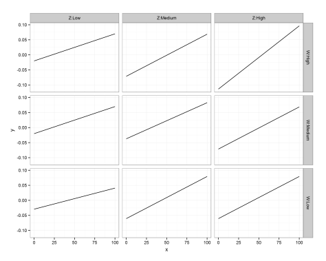
There we have it! A small multiples plot to show the results of a multiple regression analysis, with each panel showing the relationship between our response variable (Y) and continuous predictor (X) for a unique combination of our 3-level moderators (Z, W).
You’ll notice here that the facet labels have things like ‘Z:Low’ etc in them, which I coded into the data frames. This is purely because ggplot2 doesn’t automatically label the outer axes (i.e., as Z, W), and I find this easier than remembering which variable I’ve defined as rows/columns…
Hopefully this is clear – any questions, please leave a comment. The layout of R script was created by Pretty R at inside-R.org. Thanks again to Rebekah for her question on my previous post, and letting me use her analysis as an example here.
—-
Want to know more about understanding and visualising interactions in multiple linear regression? Check out my related posts:
Understanding three-way interactions between continuous variables
Three-way interactions between 2 continuous and 1 categorical variable
—-


