I posted recently (well… not that recently, now that I remember that time is linear) about how to visualise 3-way interactions between continuous and categorical variables (using 1 continuous and 2 categorical variables), which was a follow-up to my extraordinarily successful post on 3-way interactions between 3 continuous variables (by ‘extraordinarily successful’, I mean some people read it on purpose and not because they were misdirected by poorly-thought google search terms, which is what happens with the majority of my graphic insect-sex posts). I used ‘small multiples‘, and also predicting model fits when holding particular variables at distinct values.
ANYWAY…
I just had a comment on the recent post, and it got me thinking about combining these approaches:
There are a number of approaches we can use here, so I’ll run through a couple of examples. First, however, we need to make up some fake data! I don’t know anything about bone / muscle stuff (let’s not delve too far into what a PhD in biology really means), so I’ve taken the liberty of just making up some crap that I thought might vaguely make sense. You can see here that I’ve also pretended we have a weirdly complete and non-overlapping set of data, with one observation of bone for every combination of muscle (continuous predictor), age (continuous covariate), and group (categorical covariate). Note that the libraries you’ll need for this script include {dplyr}, {broom}, and {ggplot2}.
#### Create fake data ####

bone_dat <- data.frame(expand.grid(muscle = seq(50,99),
                                   age = seq(18, 65),
                                   groupA = c(0, 1)))

## Set up our coefficients to make the fake bone data
coef_int <- 250
coef_muscle <- 4.5
coef_age <- -1.3
coef_groupA <- -150
coef_muscle_age <- -0.07
coef_groupA_age <- -0.05
coef_groupA_muscle <- 0.3
coef_groupA_age_muscle <- 0.093

bone_dat <- bone_dat %>%
  mutate(bone = coef_int +
  (muscle * coef_muscle) +
  (age * coef_age) +
  (groupA * coef_groupA) +
  (muscle * age * coef_muscle_age) +
  (groupA * age * coef_groupA_age) +
  (groupA * muscle * coef_groupA_muscle) +
  (groupA * muscle * age * coef_groupA_age_muscle))

ggplot(bone_dat,
       aes(x = bone)) +
  geom_histogram(color = 'black',
                 fill = 'white') +
  theme_classic() +
  facet_grid(. ~ groupA)

## Add some random noise
noise <- rnorm(nrow(bone_dat), 0, 20)
bone_dat$bone <- bone_dat$bone + noise

#### Analyse ####

mod_bone <- lm(bone ~ muscle * age * groupA,
               data = bone_dat)

plot(mod_bone)
summary(mod_bone)
While I’ve added some noise to the fake data, it should be no surprise that our analysis shows some extremely strong effects of interactions… (!)
Call:

lm(formula = bone ~ muscle * age * groupA, data = bone_dat)
Residuals:
Min 1Q Median 3Q Max
-71.824 -13.632 0.114 13.760 70.821
Coefficients:
Estimate Std. Error t value Pr(>|t|)
(Intercept) 2.382e+02 6.730e+00 35.402 < 2e-16 ***
muscle 4.636e+00 8.868e-02 52.272 < 2e-16 ***
age -9.350e-01 1.538e-01 -6.079 1.31e-09 ***
groupA -1.417e+02 9.517e+00 -14.888 < 2e-16 ***
muscle:age -7.444e-02 2.027e-03 -36.722 < 2e-16 ***
muscle:groupA 2.213e-01 1.254e-01 1.765 0.0777 .
age:groupA -3.594e-01 2.175e-01 -1.652 0.0985 .
muscle:age:groupA 9.632e-02 2.867e-03 33.599 < 2e-16 ***
—
Signif. codes: 0 ‘***’ 0.001 ‘**’ 0.01 ‘*’ 0.05 ‘.’ 0.1 ‘ ’ 1
Residual standard error: 19.85 on 4792 degrees of freedom
Multiple R-squared: 0.9728, Adjusted R-squared: 0.9728
F-statistic: 2.451e+04 on 7 and 4792 DF, p-value: < 2.2e-16
(EDIT: Note that this post is only on how to visualise the results of your analysis; it is based on the assumption that you have done the initial data exploration and analysis steps yourself already, and are satisfied that you have the correct final model… I may write a post on this at a later date, but for now I’d recommend Zuur et al’s 2010 paper, ‘A protocol for data exploration to avoid common statistical problems‘. Or you should come on the stats course that Luc Bussière and I run).
Checking the residuals etc indicates (to nobody’s surprise) that everything is looking pretty glorious from our analysis. But how to actually interpret these interactions?
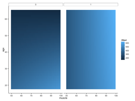
We shall definitely have to use small multiples, because otherwise we shall quickly become overwhelmed. One method is to use a ‘heatmap’ style approach; this lets us plot in the style of a 3D surface, where our predictors / covariates are on the axes, and different colour regions within parameter space represent higher or lower values. If this sounds like gibberish, it’s really quite simple to get when you see the plot:
Here, higher values of bone are in lighter shades of blue, while lower values of bone are in darker shades. Moving horizontally, vertically or diagonally through combinations of muscle and age show you how bone changes; moreover, you can see how the relationships are different in different groups (i.e., the distinct facets).
To make this plot, I used one of my favourite new packages, ‘{broom}‘, in conjunction with the ever-glorious {ggplot2}. The code is amazingly simple, using broom’s ‘augment’ function to get predicted values from our linear regression model:
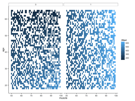
But note that one aspect of broom is that augment just adds predicted values (and other cool stuff, like standard errors around the prediction) to your original data frame. That means that if you didn’t have such a complete data set, you would be missing predicted values because you didn’t have those original combinations of variables in your data frame. For example, if we sample 50% of the fake data, modelled it in the same way and plotted it, we would get this:
Not quite so pretty. There are ways around this (e.g. using ‘predict’ to fill all the gaps), but let’s move onto some different ways of visualising the data – not least because I still feel like it’s a little hard to get a handle on what’s really going on with these interactions.
A trick that we’ve seen before for looking at interactions between continuous variables is to look at only high/low values of one, across the whole range of another: in this case, we would show how bone changes with muscle in younger and older people separately. We could then use small multiples to view these relationships in distinct panels for each group (ethnic groups, in the example provided by the commenter above).
Here, I create a fake data set to use for predictions, where I have the full range of muscle (50:99), the full range of groups (0,1), and then age is at 1 standard deviation above or below the mean. The ‘expand.grid’ function simply creates every combination of these values for us! I use ‘predict’ to create predicted values from our linear model, and then add an additional variable to tell us whether the row is for a ‘young’ or ‘old’ person (this is really just for the sake of the legend):
#### Plot high/low values of age covariate ####

bone_pred <- data.frame(expand.grid(muscle = seq(50, 99),
                      age = c(mean(bone_dat$age) +
                                sd(bone_dat$age),
                              mean(bone_dat$age) -
                                sd(bone_dat$age)),
                      groupA = c(0, 1)))

bone_pred <- cbind(bone_pred,
                   predict(mod_bone,
                     newdata = bone_pred,
                     interval = "confidence"))

bone_pred <- bone_pred %>%
  mutate(ageGroup = ifelse(age > mean(bone_dat$age), "Old", "Young"))


ggplot(bone_pred,
       aes(x = muscle,
           y = fit)) +
  geom_line(aes(colour = ageGroup)) +
#   geom_point(data = bone_dat,
#              aes(x = muscle,
#                  y = bone)) +
  facet_grid(. ~ groupA) +
  theme_classic()
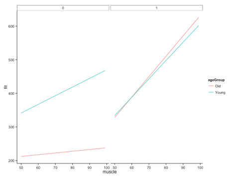
This gives us the following figure:
Here, we can quite clearly see how the relationship between muscle and bone depends on age, but that this dependency is different across groups. Cool! This is, of course, likely to be more extreme than you would find in your real data, but let’s not worry about subtlety here…
You’ll also note that I’ve commented out some lines in the specification of the plot. These show you how you would plot your raw data points onto this figure if you wanted to, but it doesn’t make a whole lot of sense here (as it would include all ages), and also our fake data set is so dense that it just obscures meaning. Good to have in your back pocket though!
Finally, what if we were more concerned with comparing the bone:muscle relationship of different groups against each other, and doing this at distinct ages? We could just switch things around, with each group a line on a single panel, with separate panels for ages. Just to make it interesting, let’s have three age groups this time: young (mean – 1SD), average (mean), old (mean + 1SD):
#### Groups on a single plot, with facets for different age values ####

avAge <- round(mean(bone_dat$age))
sdAge <- round(sd(bone_dat$age))
youngAge <- avAge - sdAge
oldAge <- avAge + sdAge

bone_pred2 <- data.frame(expand.grid(muscle = seq(50, 99),
                                      age = c(youngAge,
                                              avAge,
                                              oldAge),
                                      groupA = c(0, 1)))

bone_pred2 <- cbind(bone_pred2,
                   predict(mod_bone,
                           newdata = bone_pred2,
                           interval = "confidence"))

ggplot(bone_pred2,
       aes(x = muscle,
           y = fit,
           colour = factor(groupA))) +
  geom_line() +
  facet_grid(. ~ age) +
  theme_classic()
Created by Pretty R at inside-R.org
The code above gives us:
Interestingly, I think this gives us the most insightful version yet. Bone increases with muscle, and does so at a higher rate for those in group A (i.e., group A == 1). The positive relationship between bone and muscle diminishes at higher ages, but this is only really evident in non-A individuals.
Taking a look at our table of coefficients again, this makes sense:
Coefficients:

Estimate Std. Error t value Pr(>|t|)

(Intercept) 2.382e+02 6.730e+00 35.402 < 2e-16 ***

muscle 4.636e+00 8.868e-02 52.272 < 2e-16 ***

age -9.350e-01 1.538e-01 -6.079 1.31e-09 ***

groupA -1.417e+02 9.517e+00 -14.888 < 2e-16 ***

muscle:age -7.444e-02 2.027e-03 -36.722 < 2e-16 ***

muscle:groupA 2.213e-01 1.254e-01 1.765 0.0777 .

age:groupA -3.594e-01 2.175e-01 -1.652 0.0985 .

muscle:age:groupA 9.632e-02 2.867e-03 33.599 < 2e-16 ***

---

Signif. codes: 0 ‘***’ 0.001 ‘**’ 0.01 ‘*’ 0.05 ‘.’ 0.1 ‘ ’ 1
There is a positive interaction between group A x muscle x bone, which – in group A individuals – overrides the negative muscle x age interaction. The main effect of muscle is to increase bone mass (positive slope), while the main effect of age is to decrease it (in this particular visualisation, you can see this because there is essentially an age-related intercept that decreases along the panels).
These are just a few of the potential solutions, but I hope they also serve to indicate how taking the time to explore options can really help you figure out what’s going on in your analysis. Of course, you shouldn’t really believe these patterns if you can’t see them in your data in the first place though!
Unfortunately, I can’t help our poor reader with her decision to use Stata, but these things happen…
Note: if you like this sort of thing, why not sign up for the ‘Advancing in statistical modelling using R‘ workshop that I teach with Luc Bussière? Not only will you learn lots of cool stuff about regression (from straightforward linear models up to GLMMs), you’ll also learn tricks for manipulating and tidying data, plotting, and visualising your model fits! Also, it’s held on the bonny banks of Loch Lomond. It is delightful.
—-
Want to know more about understanding and visualising interactions in multiple linear regression? Check out my previous posts:
Understanding three-way interactions between continuous variables


you rock!!
Hi Tom,
I realize this is an older post, but it is extremely relevant for the three-way interaction I’m trying to interpret right now, so I thought I’d give it a shot and leave you a msg. I tried running the code of your last example with three different groups for one of the continuous variables. I run into an error at this step: bone_pred2 <- cbind(bone_pred2,
predict(modelt,
newdata = bone_pred2,
interval = "confidence"))
It seems bone_pred2 doesn't have the same number of rows as the dataset used for my model. I think something went wrong in the previous step when bone_pred2 is being generated, but I'm not sure why it is missing about 20 rows versus my original data. Any insight on this issue would be greatly appreciated!!
Thanks!
Anna
How to interpret 3-ways interactions in lm()?